Web Component: j-Prompt
j-Prompt
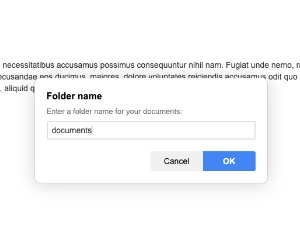
The component (singleton) displays a prompt window with a simple textbox.
Configuration:
zindex {Number}optional (default:12)width {Number}optional, max. width (default:400)cancel {String}optional, label for the cancel button (default:Cancel)submit {String}optional, label for the submit button (default:OK)
Example:
var opt = {};
opt.name = 'A title'; // optional
opt.summary = 'A small sumarization'; // optional
opt.value = ''; // a default value, optional
// opt.type = 'password'; // it can change an input type (default: `text`)
// opt.width = config.width; // max. width, optional
// opt.zindex = config.zindex; // a custom zindex, optional
// opt.centered = true; // centers the window to the middle of the screen

opt.cancel = function(val) {
    // @val {String}
    // prompt is canceled
};

opt.callback = function(val) {
    // @val {String}
    // changed
};

opt.hide = function() {
    // prompt is hidden/closed
};

SETTER('prompt/show', opt);
Author
- Peter Širka petersirka@gmail.com
- License
Created
28. december 2023
Updated
09. april 2024
Version
v1
License
https://www.totaljs.com/license/
Dark mode
Yes
Responsive
Yes
Author
Peter Širka
Email
petersirka@gmail.com