Animation
This component can animate elements with .animation class.
This component can animate elements with .animation class.
Configuration:
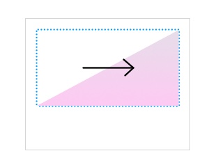
style {Number}style of animation:1opacity2scale from big to normal (default)3scale from small to normal4rotation Z5changing of X position6changing of Y position
delay {Number}delay between animation (default:200)init {Number}initialization delay (default:1000)cleaner {Number} delay for cleaner of animation classes (default:1000is multipled by count of elements)together {Boolean}all elements will be animated together (default:false)visible {Boolean}performs animation when the element with animation is visible (default:false)offset {Number}offset (threshold) for visibility (default:50)exec {String}a link to method which will be executed after animationdatasource {String}a link to data-source (if the data-source will be modified then the animation will be performed again)if {String}a condition for path (same feature likej-Part), if the value will be same asifvalue then the animation will be executed (otherwise will all elements restored for previous state)
Element configuration
Element configuration can be defined in data-animation="delay:100;order:3" attribute and it's optional:
noanimation {Boolean}disables animation for this element (only removes.animationclass)delay {Number}animation delay (default:config.delay)order {Number}animation order index, must start with1... (elements with same order will be displayed together)style {Number}a custom style for the element