Total.js Platform
348 UI components
Open-source, ready-to-use building blocks from the Total.js Platform - inputs, data grids, forms, layouts, editors and more. They run in the browser, so they fit any web app: Node.js, PHP, .NET, Python or a plain HTML page. Every component comes with a live preview, documentation and a single-file download.
- Open-source
- Any backend
- No build step
- jComponent
- JavaScript
-

NEWWebMCP
Exposes the Total.js 5 MCP tools to WebMCP-capable browsers
v1.0 -

Offline
This component displays a message box when there is no internet connection.
v1dark mode -

Remember
The component calls a function within the repeat interval.
v1 -
ServerList
The ServerList component attempts to locate a Tangular template.
v1 -

EAN13
The component will draw EAN-13 barcode according to the path value.
v1 -
TangularBadge
Tangular helper that renders colored badge elements for a label or a list of labels.
v1 -
Restart
The component is very primitive and it will only display the content if the value is positive.
v1dark mode -
Code
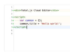
Embedded code editor, the same as CloudEditorSimple, with its settings in the config and a plain string value
v1dark mode -
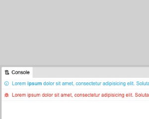
Console2
Log console panel that shows messages from a data source, with a clear button and automatic opening and closing
v1dark mode -

Packeta
Opens the Packeta widget so the user can pick a pickup point, then passes the selected point object to a callback
v1 -
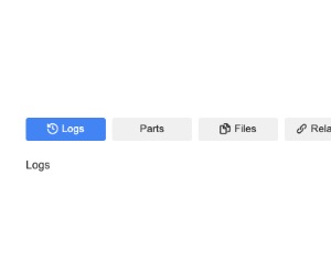
Tabs
Tabbed panels defined by section elements with a data-id and title, each with an optional icon
v1dark mode -
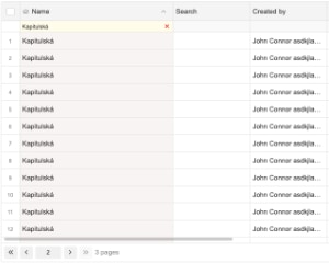
ServerGrid
Beta paged data grid for single page apps, where columns, rows, sorting, filtering and pages come from the data-source
v2 -
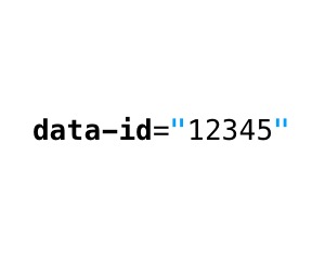
ElementID
This component fills the data-id attribute with the value read from the path.
v1 -
ExpansionPanel
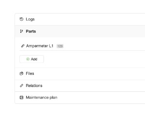
Accordion that turns child sections into labeled panels which open and close on click, optionally several at once
v1dark mode -
Attachments
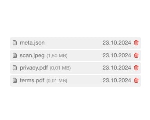
The component displays attachments in the simple list.
v1 -
EmptyInline
The component will display text inside the element if the value is empty or the array doesn't contain an item.
v1 -

Pictures
The component displays images in a simple list.
v1 -

TangularAutoFormat
This TAngular helper automatically formats email, phone number, boolean, numbers, dates or HEX color.
v1 -
AutoSelect
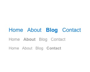
The component automatically adds .selected class according to the selector class="autoselect" within the entire HTML document.
v1 -
ClBind
Reads one item from a data source by its id and renders it inside the element, with an optional Tangular template
v1 -

HashChange
The component captures all changes for #hashtag in the URL address.
v1 -
Changer
This component captures inline changes and can affect the validate component.
v1 -
MonacoEditor
Monaco code editor bound to a path, with a configurable language and theme and a fixed or parent-based height
v1 -
OneTime
This component executes a method only once and it waits for expiration.
v1 -
TotalTemplates
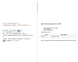
This component can render Total.js Templates.
v1 -

Cl
The component parses inline data defined in the component's element.
v1 -

DataSource
Loads data from a URL with AJAX, optionally after a delay, and binds the result to a path in the model
v1 -
TangularRGBA
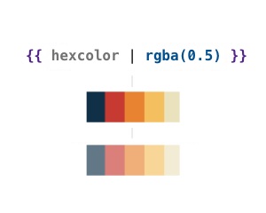
A simple Tangular template engine helper for transforming hex colors to RGBA colors.
v1 -
Prompt
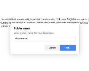
The component (singleton) displays a prompt window with single-line or multiline input.
v1dark mode -
FlowEditor
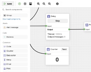
The component opens Flow editor in the iframe.
v1dark mode