Components
-
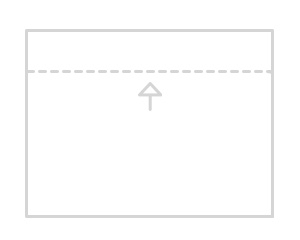
MinHeight
This component sets a minimal height for the parent (defined) element.
v1dark mode -
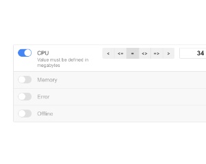
Rules
The component can create a simple rules which you can transform to some engines like Total.js Flow.
v1dark mode -
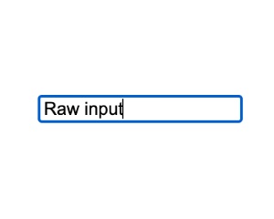
RawInput
Minimal text input with type rules, validation, length limits and autocomplete, designed for custom extensions
v1dark mode -

FileUploader
A simple component for uploading files.
v1 -
Section
Container with a fixed percentage height of its parent or window, with optional scrolling and sections that switch by path
v1dark mode -

SearchInput
Customizable search input.
v1dark mode -
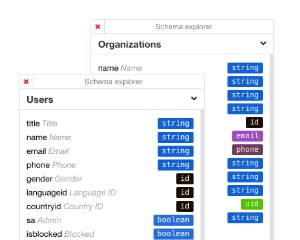
InfoWindows
The InfoWindows component expects Array of objects.
v1dark mode -
FeedbackButton
Singleton floating feedback button on the left or right edge that can link to a URL, be dismissed, and stay hidden for a set expiration time
v1dark mode -
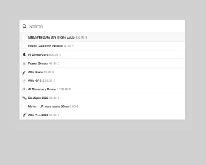
Spotlight
Singleton search overlay that queries a URL or function, shows results and recent items, and calls back with the selection
v1dark mode -
Carousel
Content carousel with swipe gestures, automatic animation at a set interval and left and right controls
v1 -
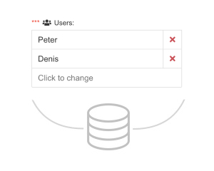
DynamicValueList
This component is very special component.
v1dark mode -

ImageUploader
A simple singleton component for uploading of resized images.
v1 -
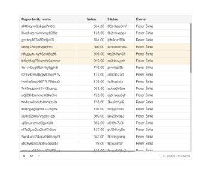
DataTable
Paginated, sortable data table (beta) for SPA and server-side listing, with scrolling, responsive layout and dark mode
v1dark mode -
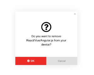
Approve
Singleton modal confirmation dialog with approve and cancel buttons that runs a callback when the user approves
v1dark mode -
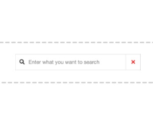
FloatingSearch
A simple floating search input.
v1dark mode -
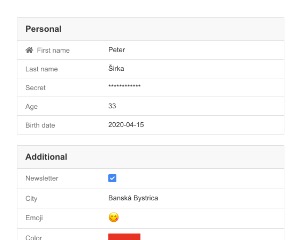
Detail
This component can render values from model.
v1dark mode -
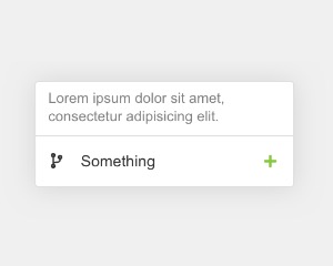
FloatingInput
Singleton floating input popup shown next to an element with x and y offsets and a minimum width, supporting dark mode
v1dark mode -
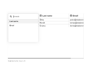
ImportCSV
Output of this component is mapped array.
v1 -
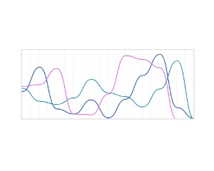
LiveStats
Live SVG line chart with one colored line per key, updated from incoming values, with dark mode support
v1dark mode -

PictureUploadExpert
Advanced picture uploader with drag and drop, multiple files, EXIF orientation and resized one-by-one upload to a URL
v1 -

Sounds
This component contains some predefined sounds like beep, fail, success, etc...
v1 -
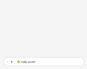
NotifyBar
Singleton top bar showing success, warning or info messages with a message history and an automatic timeout
v1dark mode -
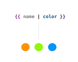
TangularColor
A simple Tangular template engine helper for rendering colors from the string.
v1 -
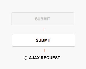
Submit
This component is very similar to j-Validation but it adds additional features which can simplify the creation of SPA.
v1 -
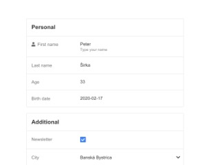
Properties2
The component uses j-DatePicker, j-TimePicker, j-Directory, j-Emoji, j-ColorPicker and j-Icons components.
v1dark mode -
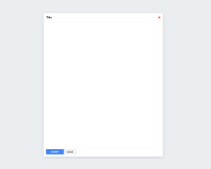
LargeForm
Large form window shown when the value of its path matches the if condition, with submit and cancel callbacks
v1dark mode -

Layout2
Making of layout is very easy.
v1 -
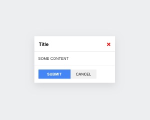
MiniForm
Small modal form shown when the value of its path matches the if condition, with submit and cancel callbacks
v2dark mode -
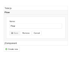
ListForm
The component watches a click event on all buttons with name attribute
v1dark mode -
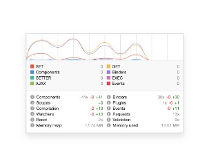
Developer
Developer overlay that monitors a jComponent single page app and shows timings, call counts and memory in Chromium
v1dark mode