Components
-
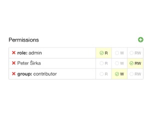
Permissions
Editor for permission lists that assigns types such as read and write to directory entries, with a search box and a data-source
v1dark mode -
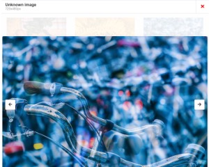
ImageViewer
Singleton image viewer with previous and next navigation over a group of images, keyboard support and a default title for unnamed ones
v1dark mode -
StatusInput
Singleton input bar with placeholder, icon, validation and a callback that receives the entered value
v1dark mode -
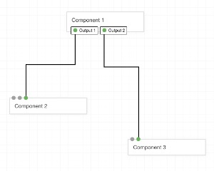
Flow
Canvas-based visual flow designer with draggable nodes and connecting lines, a background grid, zoom and optional curved lines
v1dark mode -
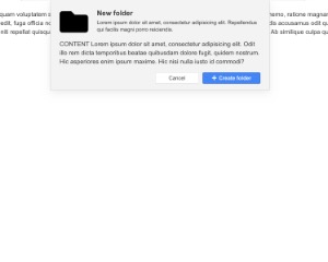
FixedModal
The content of the j-FixedModal is divided to 3 parts
v1dark mode -
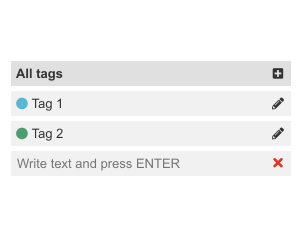
ListMenuEditable
Component for editable list menu
v1dark mode -
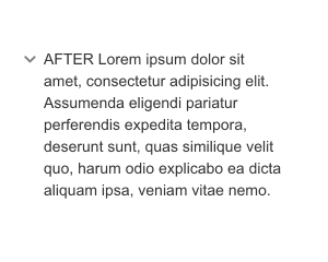
ToggleMore
Is a simple component to toggle content.
v1 -
Markdown
This component contains only Markdown parser.
v1dark mode -
Duplicator
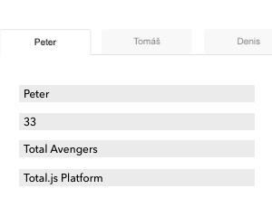
Beta component that repeats its template once per item of a data-source array, each copy bound to its own item in an independent scope
v1 -
Layout
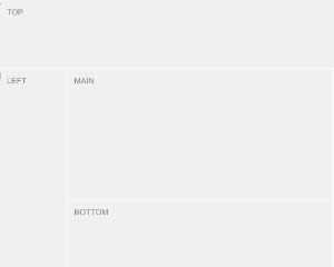
Making of layout is very easy and with a lot of possibilities.
v1dark mode -
EmojiButton
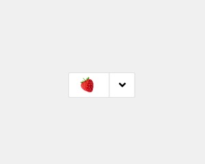
Button that shows the chosen value as a preview and opens a popup picker on click, with alignment and position options
v1dark mode -
ColorPickerButton
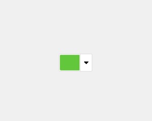
Button that opens a color picker and shows the selected color, with a default color and position options
v1dark mode -
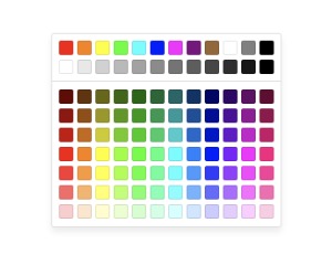
ColorPicker
Singleton color picker popup placed next to an element, with offsets, alignment and opacity for hex colors
v1dark mode -
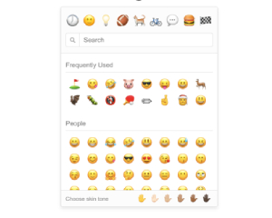
Emoji
Searchable emoji picker with categories, a history of frequently used emoticons and selectable skin tones
v1dark mode -
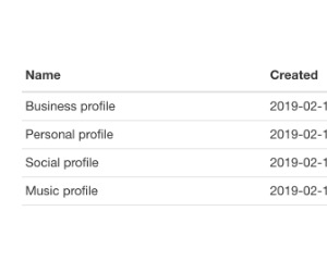
Table
Simple UI table for arrays or paged data, with row highlighting, detail rows, sorting, pagination and remembered selection
v1dark mode -
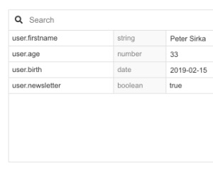
Parameters
This component can changed internal parameters.
v1dark mode -
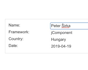
Editable
This component can edit all elements with editable class.
v1dark mode -
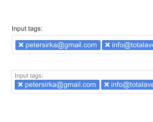
InputTags
Input that turns each entered value into a removable tag, with optional left and right icons and a lookup from a data-source
v1dark mode -
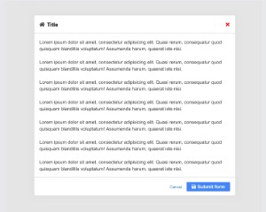
Modal
Is a simple alternative to j-Form.
v1dark mode -
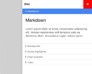
Wiki
Great component for inline Wiki/Documentation.
v1dark mode -
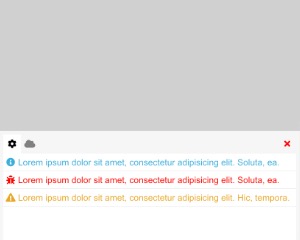
Console
Singleton log console that shows messages from a data source in tabs per app, with a clear action and dark mode
v1dark mode -
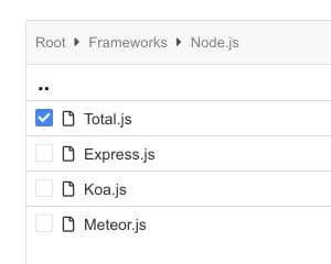
Folder
The component can render a content like file browser.
v1dark mode -
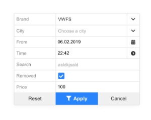
Filter
Singleton filter popup with Apply, Reset and Cancel buttons, whose options can include date, time and directory pickers
v1dark mode -
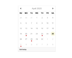
DatePicker
The component must be called manually or works with j-Input component automatically.
v1dark mode -
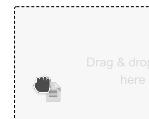
DragDropElement
On drag event displays modal inside given element with text Drop & drop files here.
v1 -
Upload
The component can perform uploading of files.
v1 -
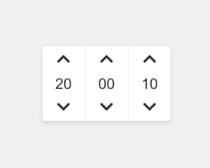
TimePicker
The component must be called manually or works with j-Input component automatically.
v1dark mode -
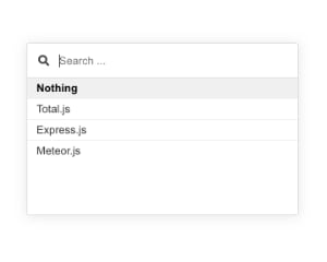
Directory
It's similar component like j-Suggestion, but has improved design and supports more handy features.
v1dark mode -
Input
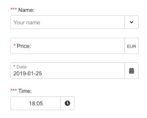
Multi-purpose input for text, email, multiline and checkbox values, with validation, formatting, masks and a directory lookup
v1dark mode -
iFrameEditable
Edits HTML safely inside an iframe whose height follows its body, for content marked as contenteditable
v1