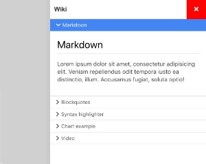
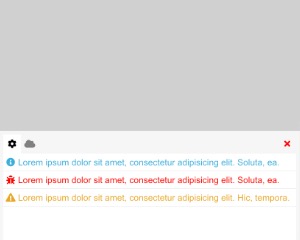
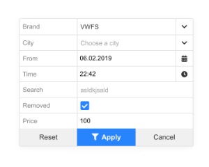
Modal
Is a simple alternative to j-Form.
Is a simple alternative to j-Form.
- Works only with
+v17 - The component moves the content of this component under
<body>tag (because of positioning)
Configuration:
title {String}modal title (it replaces aHTMLin label element in the header)width {Number}modal max-widthif {String}condition for showing of the modal, it's compared with the value within ofpathicon {String}Total icon withoutti-reload {String}link to a globalfunction(modal_component)and it's executed if the form is displayingsubmit {String}link to a globalfunction(hide)and it's executed if the submit button is pressedcancel {String}link to a globalfunction(hide)and it's executed if the cancel button is pressedenter {Boolean}capturesenterkey automatically and performs submit (default:false)center {Boolean}centers the form to middle of screenautofocus {Boolean/String}can focus an input.String===jQuery selectorfor the inputdefault {String}a short alias forDEFAULT(default, true)zindex {Number}can affect z-index (default:12)align {Number}aligns modal0centered (default),1right bottom,2left bottom,3left top,4right topheight {Number}a min. height if the content has less size than definedheight- NEW
bg {Boolean}can enable/disable a background layer (default:true) - NEW
scrollbar {Boolean}can enable/disable the scrollbar (default:false)
Good to know:
The content of the j-Modal is divided to 3 parts: header, body and footer. Each part must be defined. The component adds CSS classes to each part, for example first div will contain ui-modal-header, second ui-modal-body and third ui-modal-footer.
This component supports dynamic evaluation of the content of <script type="text/html">. The example below contains a script with HTML and the component evaluates the content if the j-Modal will be displayed (only once).
<ui-component name="modal" path="path" config="config">
    <script type="text/html">
        A CONTENT
    </script>
</ui-component>