Components
-
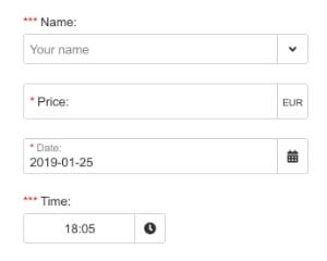
Input
Multi-purpose input for text, email, multiline and checkbox values, with validation, formatting, masks and a directory lookup
v1dark mode -
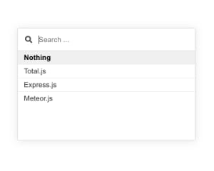
Directory
It's similar component like j-Suggestion, but has improved design and supports more handy features.
v1dark mode -
iFrameEditable
Edits HTML safely inside an iframe whose height follows its body, for content marked as contenteditable
v1 -
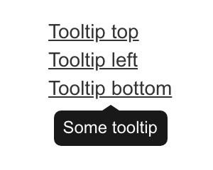
TooltipCSS
CSS-only tooltips based on the tooltip attribute, positioned with tooltip-position.
v1dark mode -
iFramePreview
Renders HTML safely inside an iframe whose height fits its body, for previews such as invoices or emails
v1 -
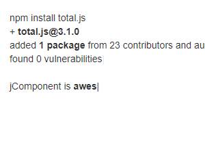
Typed
Typing animation that types out an array of texts with the typed.js library, with speed, loop and cursor options
v1 -
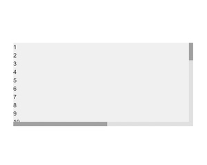
Scrollbar
Custom scrollbars. IMPORTANT
v1dark mode -
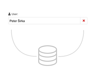
DynamicValue
This component is very special component.
v1dark mode -
SingleUpload
Upload control for one file that posts to a URL, with optional accepted file types and a title template
v1 -
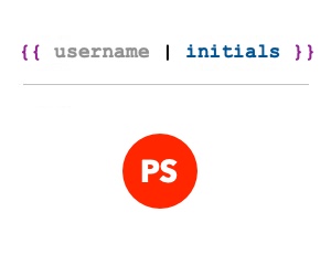
TangularInitials
A simple Tangular template engine helper for rendering initials from the name (firstname + lastname).
v1 -

CSVExport
Function that downloads an array of objects as a CSV file from the browser, with optional columns.
v1 -
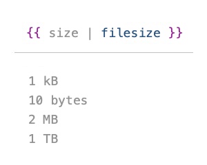
TangularFileSize
Tangular helper and Number prototype that render a file size in a human readable form.
v1 -
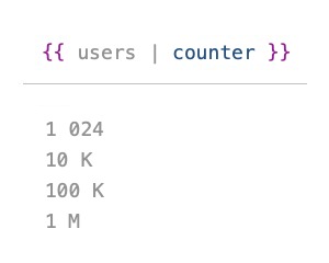
TangularCounter
This helper can create a short value from big numbers.
v1 -
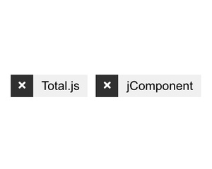
Tagger
Tagger can render items in the array and each item can be removed.
v1dark mode -

AjaxLoading
This component can show a loading text for async AJAX operations.
v1 -
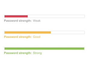
PasswordMeter
Password strength meter with a progress bar and rating label, checking length, digits, letter case and special characters
v1dark mode -
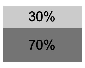
ViewBox
Container with a fixed percentage height of its parent or window, with optional scrolling, centering and disabled overlay
v1 -
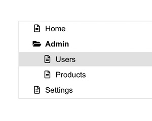
Navigation
Simple tree-style navigation menu built from a data-source, remembering open items by primary key and supporting dark mode
v1dark mode -
ScrollPercentage
Component must be attached on the element which will be as a scroll container.
v1 -
Menu
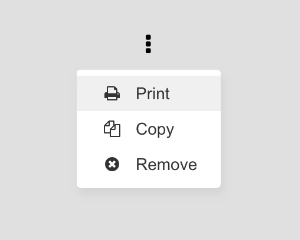
Singleton popup menu with submenus, touch support, dark mode and a large mode, closed by clicking outside it
v1dark mode -
Drawer
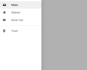
Side drawer that slides in from the left or right and shows when its path value matches the if condition, with responsive widths
v1 -
Cookie2
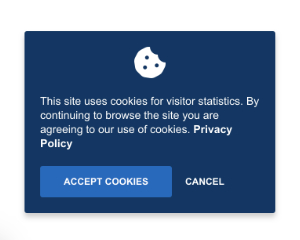
Cookie consent notice like Cookie with different default button labels, storing agreement in localStorage
v1 -

Gallery
Full-screen image preview gallery with previous and next navigation and keyboard support, designed for Bootstrap grid layouts
v1 -
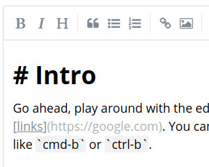
MarkdownEditor
Markdown editor based on SimpleMDE, bound to a path and updating the value as the text changes
v1 -
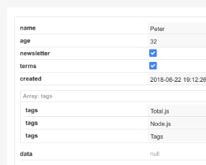
ObjectEditor
Editor for JavaScript objects that shows nested properties and arrays as editable controls bound to the path, with a change callback
v1dark mode -
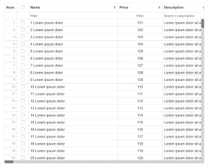
DataGrid
This grid was created for single page applications and enterprise applications.
v2dark mode -
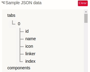
JSONTree
Shows JSON text as an expandable tree view, calls a click handler with the path of the selected node and has a clear button
v1 -
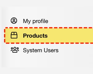
Selected
The component can set a specific class to a specific element according to the simple condition.
v1 -
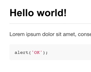
MarkdownPreview
This component depends on j-Markdown component.
v1 -
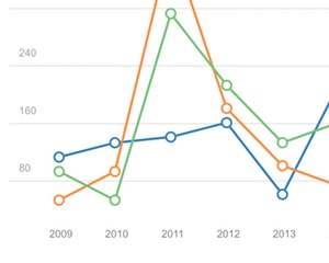
LineChart
Please review an example and keep a data-source.
v1dark mode