Components
-
TextboxList
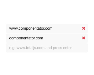
Input that adds entries to a list, with a maximum limit, type rules, error text and optional reordering of items
v1 -
Sticker
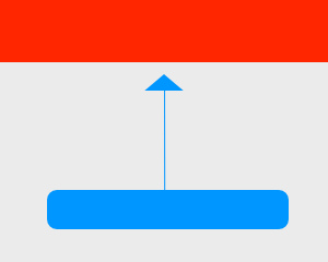
Keeps an element stuck at the top while scrolling by toggling CSS classes at scroll positions, per screen size
v1 -
ContentEditable
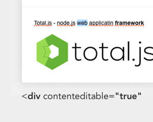
Rich text area with bold, italic, underline and link shortcuts, required validation and methods to insert content
v1 -
ContextMenu
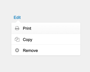
If the value isn't defined then the component uses name as value.
v1 -
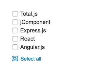
Checkboxlist
Group of checkboxes built from static items or a data source, bound to a path as a list of selected values
v1dark mode -

Map
Google Maps map bound to a path that accepts GPS coordinates or an address, with an optional draggable marker
v1 -
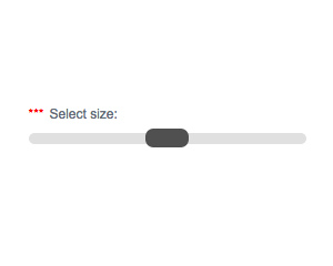
Range
Slider for choosing a number between a minimum and maximum, with a set step and optional conversion to a number type
v1dark mode -

Audio
Singleton audio player that plays and stops MP3 sounds from a URL, with a volume control
v1 -
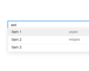
AutoComplete
Shows search suggestions under an input or contenteditable field from a search function and passes the chosen value to a callback
v1dark mode -
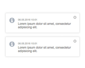
Notifications
Singleton toast notifications with icon, date, message, color and callback, auto-closing and optional native alerts when unfocused
v1 -
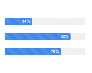
Progress
Progress bar that shows a percentage between 0 and 100 bound to the path, with optional animation
v1dark mode -
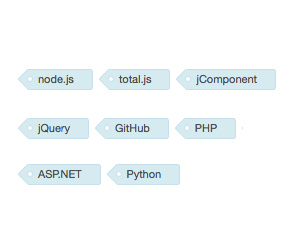
Tags
CSS-only styles for tag labels.
v5 -
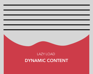
LazyContent
This component shows own content when it's visible.
v1 -

Rating
Five-star rating control that stores the clicked score, from 1 to 5, as the bound value
v1 -
Banners
Responsive banner rotator that cycles through slides at a set interval, with navigation icons
v1 -
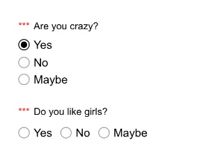
RadioButton
Group of radio buttons built from an items string or a data-source, with required, disabled and inline options
v1dark mode -
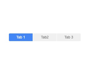
TabMenu
Tab navigation that marks the selected element with a CSS class and runs a function when the tab changes
v1dark mode -
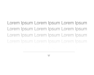
Expander
Clips content to a maximum height with a fade and a button that expands or collapses it, with configurable icons
v1 -

FileUpload
Is very helpful component for uploading e.g.
v1 -

Centered
Centered modal form moved under the body tag that appears when its path value matches the if condition, with close options
v1 -
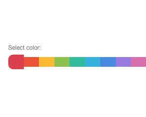
ColorSelector
Row of preset color swatches for choosing one color, with an optional empty value and disabled or required states
v1 -
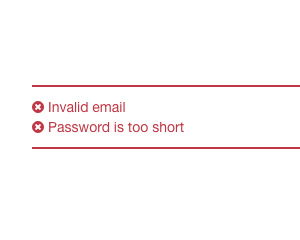
Error
Displays the error messages from an array of objects with an error property, hidden when the array is empty
v1 -

Textarea
Multi-line text field with label, icon, placeholder, length limit, error text and optional monospace font
v1dark mode -
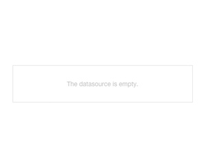
Empty
Placeholder with an icon and a message that is shown when the watched data-source is empty and hidden otherwise
v1dark mode -
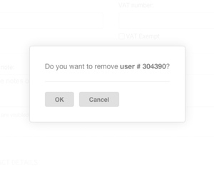
Confirm
Singleton confirmation dialog with custom buttons that passes the clicked button index or runs a callback on yes
v1dark mode -
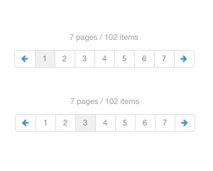
Pagination
Page navigation with numbered page buttons and pluralized page and item labels, calling a callback when a page is selected
v1dark mode -
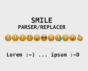
Smilefy
Function that converts text emoticons such as
v3 -
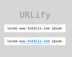
URLify
This method finds all URL addresses and creates links.
v3 -
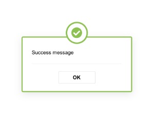
Message
Singleton message box that shows warning, success and other messages through SETTER calls, with a configurable button
v1dark mode -

Click
The component calls a method or can set a value according to the path.
v1