Progress
Progress bar that shows a percentage between 0 and 100 bound to the path, with optional animation
Configuration:
animate {Boolean}enables animation (default:true)
Progress bar that shows a percentage between 0 and 100 bound to the path, with optional animation
Configuration:
animate {Boolean} enables animation (default: true)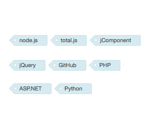
CSS-only styles for tag labels.
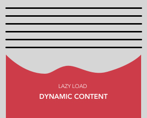
This component shows own content when it's visible.
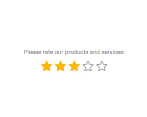
Five-star rating control that stores the clicked score, from 1 to 5, as the bound value
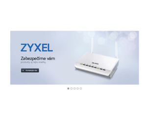
Responsive banner rotator that cycles through slides at a set interval, with navigation icons
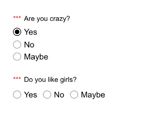
Group of radio buttons built from an items string or a data-source, with required, disabled and inline options