TextboxList
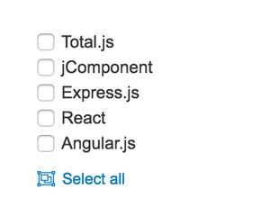
Input that adds entries to a list, with a maximum limit, type rules, error text and optional reordering of items
Configuration:
icon {String}icon for labellabel {String}label (defaultinnerHTML)placeholder {String}adds aplaceholdertext into the inputmaxlength {Number}sets a maximum length of charsdisabled {Boolean}disables this componentlimit {Number}sets a maximum length of listserror {String}error message when a limit is reached (defaultYou reach the maximum limit)required {Boolean}whether a list is required (defaultfalse)type {String}can beemail,url,currency,number,date,lower,upper,a-zor empty (default)- NEW
movable {Boolean}enables changing of position for existing items
Contributor
- improvements by Pedro Maia Costa https://github.com/pnmcosta
- improvements by Denis Grance denis@granec.cz