Web Component: j-Approve
j-Approve
- jComponent
v19|v20 - easy usage
- singleton
- works with Bootstrap
- supports dark mode
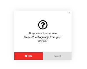
- modal
Configuration:
cancel{String} a label for cancel button (default:Cancel)- NEW:
style{Number} changes style (supported style1(default) and2)
Methods:
component.show(message, approve_button_label, [cancel_button_label], callback, [callback_cancel])
Usage:
SETTER('approve/show', message, 'Yes', function() {

});
A simple styling of buttons
// "Remove" button will be with Font-Awesome icon called: "trash-o"
SETTER('approve/show', 'Are you sure you want to remove selected item?', ':trash-o: Remove', REMOVE_FUNCTION);

// "Confirm" button will be "green" with Font-Awesome icon called: "checked-circle"
SETTER('approve/show', 'Are you sure you want to confirm selected items?', ':checked-circle: Confirm #2BA433', REMOVE_FUNCTION);
Author
- Peter Širka petersirka@gmail.com
- License
Created
30. april 2020
Updated
02. july 2024
jComponent library
19 | 20
Version
v1
License
https://www.totaljs.com/license/
Dark mode
Yes
Responsive
Yes
Author
Peter Širka
Email
petersirka@gmail.com