Web Component: j-Avatar
j-Avatar
- jComponent
v19|v20 - supports themes
- it's singleton
- inspiration from
react-user-avatar
Themes:
Avatar component needs to register your own theme. It contains default theme.
SETTER(true, 'avatar', 'register', 'THEME_NAME', 'options')Options can contain:
size{Number} Optional, a size in pixels (default:100)lighten{Number} Optional, the font color will be lightened by lighten factor of background color (default:80| from -255 to 255)radius{Number} Optional, how rounded border corners will be (default:50)background{Hex} Optional, set background color (default: selected from colorsArray)color{Hex} Optional, set font color (default: generated from background color by lighten)font{String} Optional, set font family (default:Arial)weight{String} Optional, font-weight (default:bold)class{String} Optional, this property perfomstoggleClassfor this class
Usage:
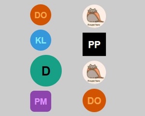
Each element of avatar needs to contain avatar class like this: <div class="avatar">. Here are custom attributes:
data-a="THEME_NAME"Optional, can contain a theme name (default:default)data-a-url="URL_TO_PICTURE"Optional, can contain a URL for user photodata-a-class="class_for_toggle_effect"Optional, can contain a class fortoggleClasseffect
Element needs to contain a user name, for example:
<div class="avatar">Peter Širka</div>or<a href="#" class="avatar">Peter Širka</a>
Good to know:
- avatar component binds all new avatars in all new components automatically
SETTER('avatar', 'refresh')performs refreshing
Author
- Denis Granec denis@granec.cz
- License
Contributor
- Big improvements by Peter Širka petersirka@gmail.com
Created
04. september 2017
Updated
11. june 2025
jComponent library
19 | 20
Version
v1
License
https://www.totaljs.com/license/
Responsive
Yes
Author
Denis Granec
Email
denis@granec.cz