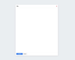
Web Component: j-Box
j-Box
- jComponent
v19|v20
Configuration:
title{String}form titleif{String}condition for showing of the form, it's compared with the value within ofpathicon{String}Font-Awesome icon withoutti-or new:ti ti-homereload{String}link to a globalfunction(fullform_component)and it's executed if the form is displayingsubmit{String}link to a globalfunction(hide)and it's executed if the submit button is pressedcancel{String}link to a globalfunction(hide)and it's executed if the cancel button is pressedenter{Boolean}capturesenterkey automatically and performs submit (default:false)center{Boolean}centers the form to middle of screenautofocus{Boolean/String}can focus an input.String===jQuery selectorfor the inputdefault{String}a short alias forDEFAULT(default, true)closebutton{Boolean}can hidexbutton (default:false)zindex{Number}can affect z-index (default:12)scrollbar{Boolean}enables custom scrollbar (default:true)scrolltop{Boolean}enables scrolling to top after form is displayed (default:true)scrollbarshadow{Boolean}optional, enables a shadow in scrollbar (default:false)style{Number}supports two styles (1: classic (default), 2: box bottom without padding, 3: box top without padding)closeoutside{Boolean}closes the form when the user clicks outside of the form (default:false)closeesc{Boolean}closes the form when the user pressesESCkeyindependent{Boolean}closing doesn't depent on the condition according to the pathpadding{Number}padding for the box (default:30)width{Number}optional, a maximal width (default:0- full width)background{Boolean}optional, enables/disables background (default:true)transparent{Boolean}optional, all elements on the background of the box will be clickable (default:false)align{String}optional,center(default),left,rightclose{String}link to a globalfunction()and it's executed if the form is closing- NEW
hide{String}link to a globalfunction()and it's executed if the form hides
The component supports dynamic evaluation of the content of <script type="text/html">. The example below contains a script with HTML and the component evaluates the content if the j-Form will be displayed (only once).
<ui-component name="box" path="path" config="config">
    <script type="text/html">
        A CONTENT
    </script>
</ui-component>
Author
- Peter Širka petersirka@gmail.com
- License
Created
12. january 2022
Updated
13. january 2026
jComponent library
19 | 20
Version
v1
License
https://www.totaljs.com/license/
Dark mode
Yes
Responsive
Yes
Author
Peter Širka
Email
petersirka@gmail.com

