Web Component: j-CheckboxListExpert
j-CheckboxListExpert
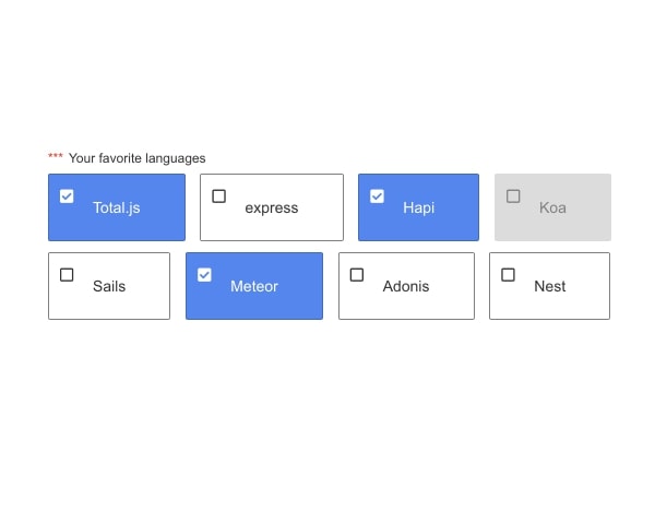
Perfect component for checboxlist with custom styles. It's a little bit advanced but absolutely worth it!
- jComponent
v19|v20
Configuration
label{String}can change the title labelrequired{Boolean}enablesrequired(default:false)disabled{Boolean}disables this control (default:false)type{String}can containnumber(default:string)class{String}inserts a class into an element with class.ui-checkboxlistexpert-containerdatasource{String}path to data-source (must be array or array of objects) or NEW:id|name,id|namevalue{String}determines a property name for value (in data-source) (default:id)disabledkey{String}determines a property name for disabled item (in data-source) (default:disabled)- NEW
selector{String}a jQuery selector for custom template (outside of the component). Works likecustom templatein data-binding
Good to know
- You must write all the styles
- Example object
{ name: 'My item', id: 1, disabled: false, classname: 'color-highlighted' } - You can use
$indexand$pathin template
Basic Styles
.my-button { display: inline-block; padding: 20px 40px; margin-right: 10px; border: 1px solid gray; cursor: pointer; border-radius: 2px; position: relative; user-select: none; }
.my-button .checkbox { position: absolute; top: 10px; left: 10px; }
.my-button.selected .checkbox i:before { content: "\f14a"; font-weight: 900; }
.my-button:hover { border-color: #4285F4; }
.my-button.selected { color: white; background: #4285F4; border-color: rgba(0, 0, 0, 0.2); }
.my-button[data-disabled="1"] { background-color: #dcdcdc; color: gray; border-color: #dcdcdc; cursor: not-allowed; }
.ui-disabled .my-button .checkbox { color: #c3c3c3; }
.ui-disabled .my-button { background-color: #dcdcdc; color: gray; border-color: #dcdcdc; cursor: not-allowed; }
.ui-disabled .my-button:hover { background-color: #dcdcdc; color: gray; border-color: #dcdcdc; }
.ui-disabled .my-button.selected { border-color: gray; background: #efefef; color: #5a5a5a; }

/* Dark mode */
.ui-dark .my-button { border-color: 1px solid #404040; color: #adadad; }
.ui-dark .my-button.selected { color: white; }
.ui-dark .my-button[data-disabled="1"] { background-color: #525252; color: gray; border-color: #525252; }
.ui-dark .ui-disabled .my-button { background-color: #525252; color: gray; border-color: #525252; }
.ui-dark .ui-disabled .my-button:hover { background-color: #525252; color: gray; border-color: #525252; }
.ui-dark .ui-disabled .my-button.selected { border-color: rgba(0, 0, 0, 0.2); background: #969696; color: #ffffff; }

/* Large mode */
.ui-large .my-button { font-size: 16px; }
Author
- Denis Granec denis@totalavengers.com
- License
Created
10. february 2020
Updated
31. january 2023
jComponent library
19 | 20
Version
v1
License
https://www.totaljs.com/license/
Dark mode
Yes
Large mode
Yes
Responsive
Yes
Author
Denis Granec
Email
denis@totalavengers.com