Web Component: j-DataGrid
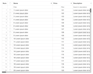
j-DataGrid
This grid was created for single page applications and enterprise applications.
- jComponent
v19|v20 - please try to understand the functionality
- needed
bootstrapgrid system - you can render more than 30 000 rows without any problem
- supports drag&drop columns
- supports sorting
- supports resizing of columns
- supports vertical/horizontal scrolling
- supports filters
- supports checkboxes
- custom scrollbars independent on OS
- responsive
- supports dark mode
- IMPORTANT column options filter needs
j-Directorycomponent
TO-DO:
- multisort
- resizing columns for touch devices
- re-ordering columns for touch devices
Data-source needs to contain:
{
    schema: 'schema_id', // NEW: optional, DataGrid supports multiple schemas (it means: multiple declaration of columns)
    items: [{ name: 'Row 1' }, { name: 'Row 2' }, ...] // items
    page: 1,    // current pages
    pages: 30,  // count of pages
    limit: 5,   // items limit per page
    count: 150  // count of items in DB
}
or raw Array but you can't use pagination and external filters:
[{ name: 'Row 1' }, { name: 'Row 2' }];Configuration:
filterlabel{String}a default placeholder for all filters (optional)rememberfilter{Boolean}with true it remembers filters for every schema (default:true)schema{String}a default schema (default:default)pluralizepages{String}pluralization for pages (optional, default:# pages,# page,# pages,# pages)pluralizeitems{String}pluralization for items (optional, default:# items,# item,# items,# items)height{Number/String}height of grid, supported values:auto(default), NEWfluid,parent(orparent1,parent2) orNUMBERas height orselectorfor jQuery.closest()minheight{Number}minimal height of grid, works withfluidandautoheight (default:200)parent{String}selector forautoheight option (default:window)margin{Number}a top margin for height (optional, default:0)boolean{String}a values for filtering of boolean values (optional, default:true|on|yes)resize{Boolean}enables resizing of columns (optional, default:true)reorder{Boolean}enables re-ordering of columns (optional, default:true)sorting{Boolean}enables sorting (optional, defaulttrue)remember{Boolean}remembers re-ordering and resizing columns (optional, defaulttrue)checkbox{Boolean}enables checkboxescolwidth{Number}a default column width in pixels (optional, default150)rowheight{Number}a default row height in pixels (optional, default:24) + it depends on CSSalignheader{String/Number}align for headerright(or2) orcenter(or1) (optional, default:left)alignfilter{String/Number}align for filter inputright(or2) orcenter(or1) (optional, default:left)align{String/Number}align for a column valueright(or2) orcenter(or1) (optional, default:left)click{String}a link to a path orfunction(row, grid, row_el), a record will be assigned/executed if the user clicks on a rowclickid{String}an identificator/property name for backwards redrawing (for previous row highlight), default:idhighlight{Boolean}each selected row (afterclick) will be highlighted (default:false)unhighlight{Boolean}enablesundo highlightingof selected row (default:true)checked{String}pathto a variable or path tofunction(rows, grid)is executed if the user selected/checked some rowsautoselect{Boolean}enables auto-select of first row in grid, it performsEXEC(config.click), default:falselimit{Number}a cluster limit, default:80numbering{Boolean}, optional defaultfalseallowtitles{Boolean}, enables titles for all row values, optional defaultfalsebutton{String}a link tofunction(btn_name, row, btn_element, event, name)is executed if the user clicks on a button in the rowexec{String}a link tofunction(type, filter, sort, page)for server-side operations only (it disables client-side sorting & filtering), supported types:refreshorpagechanged{String}pathto a variable or path tofunction(rows, grid)is executed if the user changed some rowschange{String/Boolean}boolean enables internal editing or string must contain apathto a variable or path tofunction(meta, next(meta))is executed if the user double clicks on a column (metacan benullif the grid is refreshed) +next(null)replaces previous content againcolumns{String}a path to definition ofcolumns {Array}dblclick{String}a link tofunction(row, grid, row_el)method, it's executed if the user double-clicks on a rownoborder{Boolean}can disable a border around the grid (default:false)clusterize{Boolean}can disable clustered scrolling (default:true)contextmenu{String}a link tofunction(e, grid)when the user raises context menuautoformat{Boolean}enables auto-format types likeemail,phoneandnumber(default:true)controls{Boolean}enables controls defined incolumns(default:true)hfunc{String}a link tofunction(el)method, it's executed if the user clicks on the icon added to very first header row. usefull to integrate other component with DataGrid. e.g. j-filterhfuncicon{String}hfunc icon e.g. home, cog, etc.pagination{Boolean}enables/disables pagination (default:true)config.execwill be executed if the scrollbar is at the end, and you can use as the raw responsearrayof rows
ovalue{String}a default key for obtaining ofvaluefromcolumn.options(default:id)otext{String}a default key for obtaining oftextfromcolumn.options(default:name)
Column properties:
name{String}a name of field in the row objecttext{String}a column label, text with.ti ti-homewill render Total icontitle{String}a column tooltip (optional)width{Number}a column width (optional, defaultconfig.colwidth)filter{String/Boolean}a placeholder for the filter orbooleancan disable filter for this column (optional)filtervalue{Object}optional, a preddefined filter value (default:undefined)filtertype{Number/String},1disables smart searching (default:0- it means enabled smart searching)align{String}can becenterorright(optional, default:left)template{String}can be a Tangular template and the model is the entire object of rowsorting{Boolean}enables sorting (optional, default:true)search{Boolean/String}truewill filter a value according to thetemplateresult orStringcan be a Tangular template which will be used as a value for searchformat{String/Number}can be used for date and numbers (count of decimals) field (optional), e.g.dd.MM.yyyyhide{Boolean}hides a columnlistcolumn{Boolean}default:true, false for removing column from columns listhidden{String}as an arrow functioncolumn => true--> column will be hidden (e.g. for restricting user)options{Object Array}optional, a custom filter for example[{ text: 'yes', value: true }, { text: 'no', value: false }]o {String}r link to data-sourceotext{String}optional, a key fortextfield inoptions, defaultconfig.otextovalue{String}optional, a key forvaluefield inoptions, defaultconfig.ovaluebuttonapply{String}optional, a label forApplybutton in columns, default:Applyclass{String}optional, a custom column class nameempty{String/Boolean}optional, can rewrite empty value with the value defined in empty field (truevalue uses---as a default value)min{Number}editable only a min. number valuemax{Number}editable only a max. number valuerequired{Boolean}editable onlydirsearch{String/Boolean}a placeholder forj-Directorysearch, boolean withfalsewill disable searchtype{String}optional, can contain a data-type (string,boolean,date,number,email,phoneorurl) for the fieldeditable{Boolean}enables editingcurrency{String}a currency name (must be defined inDEF.currencies)editable{String}A path to custom editablefunction(meta), important:meta.next(new_value)ormeta.cancel()colorize{Boolean}enables a colorization of the valuemonospace{Boolean}enables monospace font type- NEW
raw{Boolean}enables/disables HTML escaping in column filters (default:false) - NEW
pair{Boolean}enables/disables auto value pairing withoptionsconfiguration (default:false)
Row controls (NEW):
- can be defined as column type
controls - must defined column
template(Tangular,rowis a model for Tangular for each row) - look to example
- button
clickevent is captured toconfig.button
Filtering:
numbers: (1)numbersearches an exact number, (2)number - numberis an interval between numbersstrings: (1)stringsearches an exact string, (2)string1, string2, string3is a multiple search criteriumdates: (1) year2017searches all dates in this year, (2)2017-02-12 - 2017-03-13<-->02.12.2017 - 13.03.2017is an interval between dates, (3)12-20 - 12-31<-->20.12 - 31.12an interval between dates in the current year ir (4)2017-01 - 2018-05<-->01.2017 - 05.2018or (5)-5 days<-->-1 week<-->-10 years
Methods:
component.redraw([reselect_again])can redraw rows again (only for modifications, if you will remove some row you need to update the entire model)component.resetfilter()can reset a filtercomponent.exportrows(page_from or true from the current page, pages_count, callback(rows, internal_options), [reset_to_page or true for the current page])can export rows with server-side renderingcomponent.appendrow(row_object, [scrolldown], [prepend])appends and render rowcomponent.redrawrow(row_object, [new_object_row])redraws row or NEW: replaces+redrawsrow_objectwith a newnew_object_rowcomponent.clear()clears all changescomponent.select(row)selectsrowmust be the same object as in data-sourcecomponent.editcolumn(row_index, col_index)executesconfig.changeinternally (only for advanced usage)component.applyfilter(obj)can apply a custom filter{ name: 'Peter', age: '20 - 50' }component.resetcolumns()resets columnscomponent.readfilter()returns a current filtercomponent.rebind(schemaname__or__columnsdeclaration)the method rebinds the schemacomponent.reload()executesconfig.execwith the current filter and sortingcomponent.empty()empties all rowscomponent.redrawcolumns()redraw columns without reset them- NEW:
component.schema(name)changes a schema and refreshes data
Properties:
component.metareturns internal meta info about filters, columns and rows
Good to know:
NULL('link.to.data')evaluatesconfig.execSET('link.to.data', data, 'noscroll')-->noscrolltype disables reseting of scrolling
How to extend a class of row?
- look to the
{{ if active }}line, it extends a class of row by addingdg-active-classif theactivewill be valid
[
    '{{ if active }} dg-active-class{{ fi }}',
    { name: 'name', text: 'Name', width: 200 },
    // other columns ...
]
Multiple schemas:
<ui-component name="datagrid" path="obj">

    <script type="text/plain" data-id="SCHEMA_A">
        [
            { name: 'name', text: 'Name', width: 200 },
            // ...
        ]
    </script>

    <script type="text/plain" data-id="SCHEMA_B">
        [
            { name: 'price', text: 'Price', width: 100 },
            // ...
        ]
    </script>

</ui-component>

<script>
    // Usage
    var obj = {};
    obj.schema = 'SCHEMA_A';
    obj.items = [];

    // Changing of schema
    setTimeout(function() {
        obj.schema = 'SCHEMA_B';
        obj.items = [];
        UPD('obj');
    }, 5000);
</script>
Author
- Peter Širka petersirka@gmail.com
- License
Created
20. june 2018
Updated
25. july 2025
jComponent library
19 | 20
Version
v2
License
https://www.totaljs.com/license/
Dark mode
Yes
Responsive
Yes
Author
Peter Širka
Email
petersirka@gmail.com