Web Component: j-DatePicker
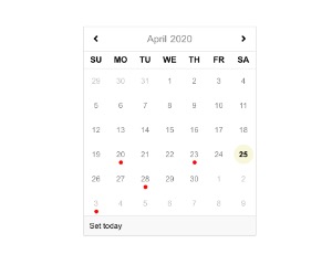
j-DatePicker
- jComponent
v19|v20 - it's improved clone of
j-Calendar - supports dark mode
- supports touch gestures (swipe) and fixed full size on mobile
Configuration:
firstday{Number}first day in the week (default:DEF.firstdayofweek)today{String}a label for theSet todaybuttonclear{String}a label for theClearbuttondays{String}days e.g.SU,MO,TU,WE,TH,FR,SA(default).months{String}months e.g.January,February,...(default).
The component must be called manually or works with j-Input component automatically. The component is a singleton.
- important add the calendar component under
<body>element
Usage
var opt = {};
opt.element = YOUR_ELEMENT;
opt.value = new Date();
// or opt.value = 'path.to.date'; --> then "opt.callback" is disabled
// opt.align {String}      : align "left" (default), "center" or "right"
// opt.position {String}   : position "top" (default) or "bottom"
// NEW: opt.clock {Boolean} : enables time (default: false)
// NEW: opt.ampm {Boolean} : enables AM/PM (default: false)

opt.clear = false; // Removes "clear" button from datepicker. If this property is not specified as "false" - "clear" button will be shown

opt.callback = function(newdate) {
    console.log('date has been changed');
};
// IMPORTANT - opt.callback() can receive "null" value as a parameter, so this check should be taken into consideration when callback function is being created.

// opt.offsetX {Number} "x" offset
// opt.offsetY {Number} "y" offset
// opt.close {Function} optional, this function can determine closing of DatePicker

// NEW and OPTIONAL
// It's callend when the DatePicker changes year/month
opt.badges = function(date, append) {
    // Appends small and red badges to the current view/month
    append([date1, date2, date3]);
};

SETTER('datepicker/show', opt);
Author
- Peter Širka petersirka@gmail.com
- License
Created
06. february 2019
Updated
15. october 2025
jComponent library
19 | 20
Version
v1
License
https://www.totaljs.com/license/
Dark mode
Yes
Responsive
Yes
Author
Peter Širka
Email
petersirka@gmail.com