Web Component: j-Detail
j-Detail
This component can render values from model. Supports inline mapping - look into the source-code of the example.
- jComponent
v19|v20
Configuration:
dateformat{String}a date format (default:DEF.dateformat)datetimeformat{String}a date/time format (default:DEF.dateformat + ' ' + DEF.timeformat)numberformat{Number}a default number format (default: empty)small{Boolean}enables smaller design (default:false)style{Number}component style (default:1), supports style2,3(minimal) and4(modern)defaultgroup{String}a default group name (default:Default)notnull{Boolean}skips nullable values (default:false)track{String}can contain paths divided by comma, this property will watch only changes in trakced keys
Data declaration:
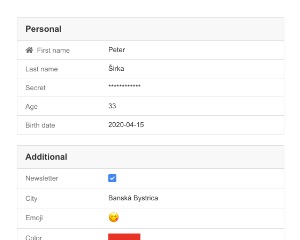
var model = { firstname: 'Peter', lastname: 'Širka', age: 33 };
var items = [{ id: 2, name: 'Banská Bystrica' }, { id: 3, name: 'Bratislava' }];
var form = [];

// The below values will be binded automatically from the "model" (according to the "path" field) because they contain "path" field
form.push({ group: 'Personal', label: 'First name', path: 'firstname', type: 'string', value: model, note: 'This is first name' });
form.push({ group: 'Personal', label: 'Last name', path: 'lastname', type: 'string', value: model, placeholder: 'String' });
form.push({ group: 'Personal', label: 'Age', path: 'age', type: 'number', value: model });

// The below values will be binded from "value" key
form.push({ group: 'Personal', label: 'Birth date', type: 'date', value: NOW });
form.push({ group: 'Additional', label: 'Newsletter', type: 'bool', value: true });
form.push({ group: 'Additional', label: 'City', type: 'list', value: 2, items: 'items' });
form.push({ group: 'Additional', label: 'Color', type: 'color', value: '#e73323' });
form.push({ group: 'Additional', label: 'Icon', type: 'fontawesome', value: 'fas fa-home' });
Data properties in data declaration:
group{String}a group name (required)label{String}a label (required)type{String}a type (required)note{String}a small note under valueformat{String}number e.g.2or date formatdd.MM.yyyydetail{String}URL address for obtaining of data forlisttype, example:/users/{0}/and{0}will be replaced with the value from listitems{Object Array/String}items forlisttype only, string can contain a path toArrayorURL addressto searchvalue{Object}a value or model with values (thenpathis required)path{String}a path to value in model (valuemust contain a model)template{String}A Tangular template (works only withtype:'template'and{{ value }}contains a raw value, and{{ item }}contains the entire item)empty{String}An empty value when the value is nullable (default:---)show{String}the conditional functionvalue.type === 'company'then displays if the evaluated condition istrue- NEW
autoformat{Boolean}enables auto-format foremail, orphones, and only forstringtype (default:false) - NEW
colorize{Boolean}colorizes the value with exceptlist,colorandicontype - NEW
plus{String}adds a value to end of rendered value fornumberandstringtypes
Allowed types in data:
stringboolnumberdatedatetimelistcoloremojifontawesomepasswordtemplate
Good to know:
- if group contains only the one char then the name of group is not rendered
Author
- Peter Širka petersirka@gmail.com
- License
Created
15. april 2020
Updated
15. january 2026
jComponent library
19 | 20
Version
v1
License
https://www.totaljs.com/license/
Dark mode
Yes
Responsive
Yes
Author
Peter Širka
Email
petersirka@gmail.com