Web Component: j-Directory
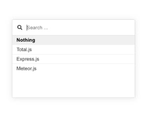
j-Directory
It's similar component like j-Suggestion, but has improved design and supports more handy features.
- singleton
- works with touches
- supports dark mode
IMPORTANT: by default this component renders a value as a text from
nameproperty.
- jComponent
v19|v20
Methods:
Method: component.show(options)
options.element{Element/jQuery Element}options.items{Array/String/Function}a list of items (Stringtype means a link to data-source)options.offsetX{Number}optional,xoffset (default:0)options.offsetY{Number}optional,yoffset (default:0)options.offsetWidth{Number}optional,widthoffset (default:0)options.placeholder{String}optional, a placeholder for search field- NEW
options.height{Number}optional, a height of the container (default:180) options.render{Function}optional, a function for customized render of itemfunction(item, text)must returnHTMLoptions.custom{Boolean/String}optional, enables returning a value not defined inoptions.items, default:falseoptions.minwidth{Number}optional, a minimal width, default200options.maxwidth{Number}optional, a maximal width, defaultinfiniteoptions.callback(selected_item, element, iscustom, e){Function}is triggered when the user clicks on the itemoptions.key{String}optional, a defaultkeyfortextvalue (default:name)options.empty{String}optional, adds empty fieldoptions.exclude{Function}optional, can exclude items and must return a booleanfunction(item){ return item.id !== 100 }options.close{Function}optional, can determine closing of paneloptions.search{Boolean/String}optional, can hide search field (default:true) or{String}(key name) can map a value for searchingoptions.selected{Object}optional, can contain a selected value (default:undefined)options.align{String}optional,left(default),rightorcenteroptions.position{String}optional,top(default),bottomoptions.raw{Boolean}optional, this option disables escaping of characters (in other words: HTML content will be allowed in labels of items, default:false)options.classname{String}optional, a custom container class for all items- absolute positioning works only if
options.elementis not definedoptions.x{Number}absolute position Xoptions.y{Number}absolute position y
options.checkbox{Boolean}optional, enables checkboxesoptions.checked{Array String}optional, identifiers of checked items- targeted for
options.items{Function(q, next)} - the callback returns only raw identifiers
Array{String}
- targeted for
- NEW
options.template{String}optional, a custom Tangular template e.g.{{ name }}(default: null) - NEW
options.fuzzy{Boolean}optional, it can disable fuzzy search (default:true)
Method: component.hide()
Configuration:
placeholder- a placeholder for the search inputcreate- a placeholder forCreatelabel (default:Create)
Supported item fields:
name{String}a label nametemplate{String}optional, a custom Tangular templateclassname{String}optional, adds additional classes into the<li>elementdisabled{Boolean}optional, it can disable itemselected{Boolean}optional, it selects item
Formatting via Tangular:
var opt = {};
opt.items = [];
opt.push({ name: 'Total.js', template: '<b>{{ name }}</b>' });
Formatting via custom function:
var opt = {};
opt.items = [];
opt.push({ name: 'Total.js' });
opt.push({ name: 'Express.js' });
opt.push({ name: 'Koa.js' });
opt.render = function(item, name) {
    return '<b>' + name + '</b>';
};
Adding of custom class:
var opt = {};
opt.items = [];
opt.push({ name: 'Total.js', classname: 'your_class_name' });
Server-side searching:
var opt = {};

opt.element = your_element;

opt.items = function(search, next) {
    next([{ name: 'Item 1' }, { name: 'Item 2' }]);
};

opt.callback = function(selected) {
    console.log(selected);
};

SETTER('directory/show', opt);
Good to know:
- if
checkboxes:truethen the component extend items by adding a timestampselectedts{Number}due to order
Author
- Peter Širka petersirka@gmail.com
- License
Created
26. january 2019
Updated
04. february 2026
jComponent library
19 | 20
Version
v1
License
https://www.totaljs.com/license/
Dark mode
Yes
Responsive
Yes
Author
Peter Širka
Email
petersirka@gmail.com