Web Component: j-DropdownCheckbox
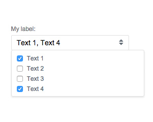
j-DropdownCheckbox
NEW now supports dark mode
jComponent
v19|v20
Configuration:
required{Boolean}(optional) enables "required" (default:false)items{String}(optional) static itemskey1|value1, key2 with value, key3|valueicon{String}(optional) icon for label withoutti-e.g.home,cog, etc.checkicon{String}(optional) check icon withoutti-, (default:check).label{String}(optional) label (default is HTML content)datasource{String}path to data-source (must be array)text{String}determines a property name for text (in data-source), default:namevalue{String}determines a property name for value (in data-source) default :iddisabled{Boolean}(optional) disables this componentcleaner{Boolean}(optional) removes non-exist values (default:true)limit{Number}(optional) sets a limit for selected items (default:0)visible{Number}(optional) sets a maximum visible items then showX selected(default:0)selectedtext{String}(optional) sets a message for maximum visible items e.g.{0} selected from {1}(default:{0} selected)alltext{String}(optional) when all items are selected this is showed (default:All selectedyou can disable it withnull)placeholder{String}(optional) sets a text for placeholder
Author
- Peter Širka petersirka@gmail.com
- License
Created
05. august 2015
Updated
25. january 2023
jComponent library
19 | 20
Version
v1
License
https://www.totaljs.com/license/
Dark mode
Yes
Responsive
Yes
Author
Peter Širka
Email
petersirka@gmail.com