Web Component: j-Editable
j-Editable
This component can edit all elements with editable class. It works with data-bind or dynamic values. Learn more from example.
Configuration:
autofocus{Boolean} focuses first item (default:false)validate{Boolean} can disable validation (default:true)disabled{Boolean} can disable editing (it addsui-editable-disabledandui-editable-enabledclass), default:falsechanged{String} optional, a link to a method or path --> it will contain the object with changed values onlyenter{String} optional, a link to a methodmethod(path, value, el), the method is executed if the user pressesENTERescape{String} optional, a link to a methodmethod(path, value, el), the method is executed if the user pressesESCcan{String} optional, a link to methodmethod(opt, el)must returnboolean, it meanscan edit?error{String} optional, a link to methodmethod(el, isInvalid, meta)is evaluated when the item is invalid and vice-versa- NEW
class{String}optional, adds a class name in the formui-editable-CLASS(default:default)
data-editable attribute describes behaviour:
path{String} a relative path to property (can be inherited fromdata-bindautomatically)required{Boolean} optional, enables "required" (default:false)type{String} optional, can bestring(default),date,number,boolean,emailorhtmlNEWtagscan{String} optional, a path tofunction(opt, el)must returnboolean, it meanscan edit?save{String} optional, a path tofunction(opt, accepted(boolean)),acceptedfunction must be evaluatedformat{String} optional, a format fordate, default:yyyy-MM-dddirsource{String} optional, path to a data-sourcedircustom{String/Boolean} optional, can contain a path tofunction(val, next(new_val))or can beBoolean. This option can enable adding a custom value (value not defined in data-source)dirrender{String} optional, a path tofunction(item, text)(must return HTML forj-Directory), this function can affect list of items inj-Directorydirminwidth{Number} optional, a minimum width forj-Directory, default:200dirmaxwidth{Number} optional, a maximum width forj-Directorydirplaceholder{String} optional, a placeholder forj-Directorydirempty{String} optional, adds an empty field forj-Directorydirkey{String} optional, a key name for reading oftextindirsource(default:name)dirvalue{String} optional, a key name for reading ofvalueindirsource(default:id)dirsearch{Boolean} optional, can disable search forj-Directoryautosource{String} a path tosearchfunction inautocomplete,function(search, render(arr))autovalue{String} a property path for the value inautosourcemaxlength{Number} a maxlengthminvalue{Number} a min. value for number type (default:undefined)maxvalue{Number} a max. value for number type (default:undefined)rebind{Boolean} iftruerebindsdata-bindon this element only (default:0)validate{String} optional, a condition for validating of value, can contain a link tofunction(value)or!!value.match(/[a-z]+/)multiline{Boolean} optional, enables multiline + appends classeditable-multiline(inline-block+width:100%) when it's editing (default:false)raw{Boolean} optional, whentruethen the current HTML content will be as a placeholder if the value isnullable(default:true)accept{String} optional, a condition for accepting of value, can contain a link tofunction(value)or!!value.match(/[a-z]+/)is similar tovalidateempty{String} optional, enables empty value and can contain empty label or1ortruefor autorebindof binderinvalid{String} optional, a link to methodmethod(el, isInvalid, meta)is evaluated when the item is invalid and vice-versa
Methods:
- NEW:
component.changed()returns an object with changed data
Good to know:
- if the user presses some
keythen the editable element will containkeypressedclass as long as they haven't left the control - each changed element will contain class
changed - if the component changes some values, the main element will contain class
ui-editable-changed - if the element has
data-bindwithempty, it will be cleared after focus - NEW now supports
tagstype. For now supports only withrebindanddata-bind. (data-bindtemplatewith{jQuery selector}works from+v18) - NEW if the element (or parent, or parent of parent) contains attribute
data-disabled="1", the control will be disabled - NEW hidden and disabled elements won't be validated
Author
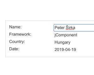
- Peter Širka petersirka@gmail.com
- License
Created
11. february 2019
Updated
28. september 2023
Version
v1
License
https://www.totaljs.com/license/
Dark mode
Yes
Responsive
Yes
Author
Peter Širka
Email
petersirka@gmail.com