Web Component: j-FloatingInput
j-FloatingInput
- jComponent
v19|v20 - singleton
- supports dark mode
Methods:
Method: component.show(options)
options.element{Element/jQuery Element}options.offsetX{Number}optional,xoffset (default:0)options.offsetY{Number}optional,yoffset (default:0)options.offsetWidth{Number}optional,widthoffset (default:0)options.placeholder{String}optional, a placeholder for search fieldoptions.minwidth{Number}optional, a minimal width, default200options.maxwidth{Number}optional, a maximal width, defaultinfiniteoptions.maxlength{Number}optional, a maximal length of value, default50options.callback(value, element){Function}is triggered when the user clicks on the itemoptions.icon{String}optional, Font-Awesome iconoptions.close{Function}optional, can determine closing of paneloptions.align{String}optional,left(default),rightorcenteroptions.value{String}optional, a default value for the inputoptions.position{String}optional,top(default),bottomoptions.summary{String}additional help contentoptions.monospace{Boolean}enables monospace fontoptions.select{Boolean}selects text- NEW
options.multiline{Boolean}enables multiline - NEW
options.height{Number}a height for multiline (default:100)
Method: component.hide()
Configuration:
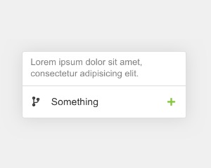
placeholder- a placeholder for the input
Author
- Peter Širka petersirka@gmail.com
- License
Created
18. march 2020
Updated
22. july 2024
jComponent library
19 | 20
Version
v1
License
https://www.totaljs.com/license/
Dark mode
Yes
Responsive
Yes
Author
Peter Širka
Email
petersirka@gmail.com