Web Component: j-Grid
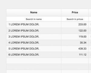
j-Grid
- please try to understand the functionality
- needed
bootstrapgrid system
Data-source needs to contain:
{
    items: [{ name: 'Row 1' }, { name: 'Row 2' }, ...] // items
    page: 1,    // current pages
    pages: 30,  // count of pages
    limit: 5,   // items limit per page
    count: 150  // count of items in DB
}Configuration:
filter{Boolean} shows a filter (optional, default:true)filterlabel{String} a default placeholder for all filters (optional)external{Boolean} is an external data-source (dynamic data loading) (optinal, default:false)pluralizepages{String} pluralization for pages (optional, default:# pages,# page,# pages,# pages)pluralizeitems{String} pluralization for items (optional, default:# items,# item,# items,# items)exec{String} a link tofunction(type, filter, sort, page), it's evaluated if the grid performs some operationspadding{Number} height padding (optional, default:0)autosize{Boolean} enables full-height auto-size (optional, defaulttrue)boolean{String} a values for filtering of boolean values (optional, default:true|on|yes)pagination{Boolean} shows pagination panel (optional, default:false)init{Function} an init function for e.g. custom columnschecked{Function} if rows will contain<input type="checkboxthen this function will be evaluated when the checkbox is checked
Column properties:
name{String} a name of field in the objecttext{String} a column labeltitle{String} a column tooltip (optional)size{Number} a column width:1small,2medium,3large,4very large (optional, default1)size{String} a column width in pixels, value needs to containspxe.g.20pxfilter{String/Boolean} a placeholder for the filter orbooleancan disable filter for this column (optional)format{String/Number} for formatting values (stringfor date,numberfor numbers)background{String} a background color (optional)align{String} can becenterorright(optional, default:left)template{String} can be a Tangular template and the model is the whole object of rowrender{String/Function(value, column, row)} a custom rendering,stringis evaluated as an arrow functionheader{String/Function(column)} a custom rendering of header,stringis evaluated as an arrow functionsort{Boolean} enables sorting (optional, default:true)class{String} additional classes for the column, e.g.hidden-xssearch{Boolean/String}truewill filter a value according to thetemplateresult orStringcan be a Tangular template which will be used as a value for search
Filtering:
numbers: (1)numbersearches an exact number, (2)number / numberis an interval between numbersstrings: (1)stringsearches an exact string, (2)string1, string2, string3is a multiple search criteriumdates: (1) year2017searches all dates in this year, (2)2017-02-12 / 2017-03-13is an interval between dates, (3)20.12 / 31.12an interval between dates in the current year
Author
- Peter Širka petersirka@gmail.com
- License
Created
26. august 2017
Updated
31. january 2023
Version
v1
License
https://www.totaljs.com/license/
Responsive
Yes
Author
Peter Širka
Email
petersirka@gmail.com