Web Component: j-Info
j-Info
- singleton
- show:
SETTER('info', 'show', options) - hide:
SETTER('info', 'hide')
Show options:
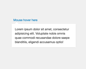
opt.element{jQuery} an element where will bej-Infodisplayedopt.align{String} alignleft(default),center,rightorhalfopt.html{String} a HTML contentopt.name{String} a name of Tangular template, must be defined inj-Infobody like example belowopt.value{Object} a model for Tangular templateopt.minwidth{Number} a minimal width (default:100)opt.maxwidth{Number} a maximal width (default:280)opt.offsetX{Number}xoffset (default:0)opt.offsetY{Number}yoffset (default:0)opt.offsetWidth{Number}widthoffset (default:0)opt.callback{Function(isvisible)} a callback is executed when the element is hiddenopt.class{String} a custom class nameopt.closeclick{Boolean} closes info when user performs mouse click (default:false)- NEW
opt.position{String} positiontop(default) orbottom - NEW
opt.x{Number} enables absolute position (opt.yis not required) - NEW
opt.y{Number} enables absolute position (opt.xis not required)
var opt = {};
opt.element = YOUR_ELEMENT;
opt.html = 'TEST';
SETTER('info', 'show', opt);
or with Tangular templates:
<ui-component name="info">

    <script type="text/html" name="template1">
        {{ value.name }}
    </script>

    <script type="text/html" name="template2">
        <h2>{{ value.firstname }} {{ value.lastname }}</h2>
    </script>

    <script type="text/html" name="template3">
        {{ value.description }}
    </script>

</ui-component>

<script>
function some_caller() {
    var opt = {};
    opt.element = YOUR_ELEMENT;
    opt.name = 'template1';
    opt.value = { name: 'Peter' };
    SETTER('info', 'show', opt);
}
</script>
Author
- Peter Širka petersirka@gmail.com
- License
Created
22. august 2016
Updated
11. january 2024
Version
v1
License
https://www.totaljs.com/license/
Dark mode
Yes
Responsive
Yes
Author
Peter Širka
Email
petersirka@gmail.com