Web Component: j-Input
j-Input
j-Input is multifuncional input component which supports a lot of features and it's optimized for everyday usage. It's a great alternative to j-Textbox and j-Dropdown. Works only with jComponent +v17.
- jComponent
v19|v20
Configuration:
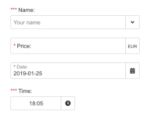
type{String}optional, values:- empty value means default
text email,multilinecheckboxphonepasswordzipdate(needsdatepickercomponent)- NEW:
datetime(needsdatepickercomponent) time(needstimepickercomponent)color(needscolorpickercomponent)icon(needsfaiconscomponent)emoji(needsemojicomponent)urlnumbernumber2(nullable)searchlowerupperslugid- NEW:
radiobutton - NEW:
tags - NEW:
tags-lower - NEW:
tags-upper - NEW:
tags-id - NEW:
tags-email - NEW:
tags-slug - NEW:
tags-phone - NEW:
tags-url
- empty value means default
required{Boolean}optional, enables "required" (default:false)icon{String}optional, icon for label e.g.home,cog, etc.licon{String}optional, left icon e.g.home,cog, etc.liconclick{String}optional, a path to methodfunction(component, input)ricon{String}optional, right icon e.g.home,cog, etc.riconclick{String}optional, a path to methodfunction(component, input)label{String}optional, a label (default is HTML content)autofocus{Boolean}optional, focuses the input (default:false)align{String}optional,left(default),2/rightor1/centerafter{String}optional, it means a char after label (default::)autofill{Boolean/String}optional, enables browser's autofill feature (stringwill be used as an input name, default:false)placeholder{String}optional, adds aplaceholdertext into the inputmaxlength{Number}optional, sets a maximum length of chars (default:200)minlength{Number}optional, sets a minimum length of charsminvalue{Number}optional, a minimal value fornumbertypemaxvalue{Number}optional, a maximal value fornumbertypeincrement{Number}optional, sets a value for incrementing (default:1)validate{String}optional, a condition for validating of value, can contain a link tofunction(value)or!!value.match(/[a-z]+/)format{String}optional, output formatting e.g. fordatetype:yyyy-MM-dd, fortimetype:HH:mm, fornumberyou can define max. decimals (Default:auto)disabled{Boolean}optional, disables this componenterror{String}optional, adds astringtext under the componentautocomplete{String}optional, needs to contain a link to a function, is triggered onfocuseventspaces{Boolean}optional, enables spaces otherwise it removes them (default:true)innerlabel{Boolean}optional, enables inner label (default:true)dirsource{String}optional, path to a data-source or NEW tofunction(search, next)(path must contain/or NEW:id|name,id|namedircustom{String/Boolean}optional, can contain a path tofunction(val, next(new_val))or can beBoolean. This option can enable adding a custom value (value not defined in data-source)dirrender{String}optional, a path tofunction(item, text)(must return HTML forj-Directory), this function can affect list of items inj-Directorydirminwidth{Number}optional, a minimum width forj-Directory, default:200dirmaxwidth{Number}optional, a maximum width forj-Directorydiroffsety{Number}optional,Yoffset (default:0)diroffsetx{Number}optional,Xoffset (default:0)dirplaceholder{String}optional, a placeholder forj-Directorydirempty{String}optional, adds an empty field forj-Directorydirkey{String}optional, a key name for reading oftextindirsource(default:name)dirvalue{String}optional, a key name for reading ofvalueindirsource(default:id)direxclude{Boolean}optional, excludes a current value fromj-Directory(default:true)dirsearch{Boolean|String}optional, can disable search inj-Directory(default:true) or{String}(key name) can map a value for searchingdirraw{Boolean}optional, can disable escaping of items forj-Directory(default:false)dirdetail{String}optional, a link to the functionfunction(val, next(NEW_TEXT))(targeted for todirsource)dirfilter{String}optional, an inline filter conditional method, for example:value.id !== 2(targeted for todirsource)- NEW:
dirrawrender{Boolean}optional, if thedirsourcedoesn't include value it will render a raw value (default:true) mask{String}optional, can contain a mask in the form###/##(#is replaced for a char)maskregexp{String}optional, can contain RegExp for each char in the form\d,\d,\d,null,\d,\d(,is delimiter)masktidy{Boolean}optional, the component returns only raw chars without fixed chars (default:false)autosource{String}a path to the search sourceArray(NEW) orfunction(search, render(arr))for dynamic searchingautovalue{String}a property path for the value inautosource, default:nameautoexec{String}a path methodfunction(item, next(value_to_input))searchalign{Number}can align icon ontype:searchto left (2) or right (1, default)forcevalidation{Boolean}enables for force validation forphoneandemail(default:true)camouflage{Boolean|String}masks the value in the input after is triggeredblurevent (default:false) or it can beStringwhich will be used as a camouflagemonospace{Boolean}enablesmonospacedfont (default:false)multiple{Boolean}enables checkboxes ifdirsourceis not emptytabindex{Number}adds a tabindex (default:0)tabs{Boolean}enables tabs for multiline (default:true)readonly{Boolean}block text field edition (default:false)transform{String}a link to thefunction(value, config)for transforming of entered valuesmultiline{Boolean}works only withradiobuttontypeseparator{String|Boolean}a separator for multiple rendered valuesrealtime{Boolean}enables real-time binding (default:true)exec{String}a link to thefunction(value, element)which will be evaluated if the input is affected
Interesting:
type:dateneedsdatepickercomponenttype:timeneedstimepickercomponentdirsource:path.to.datasourceneedsdirectorycomponent- if
liconorriconstarts with!then the component render a raw value instead oficon ui-input-okclass is binded when the input is validated and filledSET('path', 'camouflage', 'show');shows the value for 2000 ms
https://www.youtube.com/watch?v=Ne3ezaP0w34Author
- Peter Širka petersirka@gmail.com
- License
Created
26. january 2019
Updated
10. march 2026
jComponent library
19 | 20
Version
v1
License
https://www.totaljs.com/license/
Dark mode
Yes
Responsive
Yes
Author
Peter Širka
Email
petersirka@gmail.com