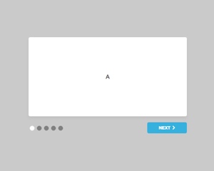
Web Component: j-Intro
j-Intro
- jComponent
v19|v20
Configuration:
if{String}condition for showing of the intro, it's compared with the value within ofpathnext{String}optional, text for the next step button (default:Next)close{String}optional, text for the close step button (default:Done)page{String}optional, a link to methodfunction(page) {}it's executed when page is changedexec{String}optional, a link to methodfunction() {}it's executed when the intro is closedcheck{String}optional, a link to methodfunction(done) {}it's executed when is clicked on button last buttonremove{Boolean}optional, whentruethen the component will be removed after close (default:false)closebutton{Boolean}shows close button at the right top corner (default:false)width{Number}a maximum width (default:400)height{Number}height (default:300)- NEW:
delay{Number}a delay fornextbutton between clicks - NEW:
nexticon{String}a done icon (default:ti ti-chevron-right) - NEW:
doneicon{String}a done icon (default:ti ti-check-circle)
Good to know:
- each button with
name="next"will be used asnextbutton - each button with
name="close"will be used asclosebutton - a link with
nextclass provides will be used as anextbutton - a link with
closeclass provides will be used as aclosebutton
Author
- Peter Širka petersirka@gmail.com
- License
Created
16. may 2017
Updated
09. january 2026
jComponent library
19 | 20
Version
v1
License
https://www.totaljs.com/license/
Dark mode
Yes
Responsive
Yes
Author
Peter Širka
Email
petersirka@gmail.com

