Web Component: j-Layout
j-Layout
- This component can create a layout for your SPA. This component is a bit harder for understanding, but it's very helpful.
j-Layoutuses jComponent+v17.
Configuration:
parent{String}can containparent,windowor jQuery selector for theclosestmethod (default:window)margin{Number}adds margin for theheight(default:0)remember{Boolean}can remember last settings of layout for resizing (default:true)space{Number}internal, contains a space between panels (default:1)border{Number}internal, contains a border size (default:0)resize{String}internal, a path to method which it's executed when the layout is resizedautoresize{Boolean}enables auto-resize (default:true)
Methods:
component.refresh()refreshes layoutcomponent.resize()performs resizecomponent.reset()performs reset of resizingcomponent.layout(name)changes a layout (like two way data-binding)component.rebind(code_string)makes a new layout configurationcomponent.lock(type, [boolean])locks the panel
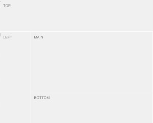
Panel types:
leftleft panel, resizablerightright panel, resizableright2right panel will be next to the left panel and usesrightkey in the config, resizabletoptop panel, resizable (it's panel on top of all panels)top2top panel, resizable and usestopkey in the config (it is betweenleftandrightpanel)bottombottom panel, resizable (it's panel on bottom of all panels)bottom2bottom panel, resizable and usesbottomkey in the config (it is betweenleftandrightpanel)mainmain panel, can't be resizable and size is counted automatically
Layout:
Making of layout is very easy and with a lot of possibilities. Layout must have own HTML structure. Look to example. The example below describes only meta data of the layout.
size{Number/String}can contain a height/width of panel according to the panel type. Number120defines pixels and String100%can define percentageminsize{Number/String}is a minimal size of the panel while the panel is resizing (default:sizevalue)maxsize{Number/String}is a maximal size of the panel while the panel is resizing (default: auto-counted)resize{Boolean}enables resizing of the panel with exceptmainpanel (it's counted automatically)show{Boolean}enables visibility (default:false)
{
    top: { size: 80, resize: true, minsize: 50 }, // top panel
    right: { size: 100 },
    bottom: { size: 100 }, // bottom panel
    left: { size: 100, resize: true }, // left panel
    main: {}, // main panel

    // Can contain a different template for various display types
    // lg = Large display, md = Medium display, sm = Small display, xs = Extra small display
    md: {
        top: { show: true, size: 80 },
        bottom: { show: false },
        left: { show: false },
        main: { show: true }
    },

    // Custom layouts
    detail: {

        // Custom display types in custom layouts
        md: {
            top: { show: true },
            bottom: { show: true },
            main: { show: true },
            left: { show: false },
            right: { show: true, size: 300 }
        },
        xs: {
            top: { show: true },
            bottom: { show: true },
            main: { show: false },
            left: { show: false },
            right: { show: true, size: '100%' }
        }
    }
}
Good to know:
- IMPORTANT: this component must contain meta-data of the layout wrapped in
<script type="text/plain"></script> - each panel is
sectionelement and must containdata-type="top"attribute with type of panel - define panels only which you will use
- ordering of all
sectionelements isn't important top2usestopconfig keyright2usesrightconfig keybottom2usesbottomconfig key
Author
- Peter Širka petersirka@gmail.com
- License
Created
04. may 2019
Updated
07. march 2023
Version
v1
License
https://www.totaljs.com/license/
Dark mode
Yes
Responsive
Yes
Author
Peter Širka
Email
petersirka@gmail.com