Web Component: j-ListDetail
j-ListDetail
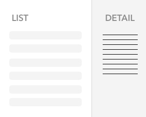
The component divides the content for listing part and detail part. Displaying of detail part depends on the path {Boolean}.
- jComponent
v19|v20
Configuration:
parent{String}parent element for obtaining of width/height (default:auto)margin{Number}a margin for height (default:0)width{Number/String}a detail panel width (default:35%)minwidth{Number/String}a minimal width of the detail panel (default:20%)maxwidth{Number/String}a maximal width of the detail panel (default:50%)resize{Boolean}enables/disables detail panel resizing (default:true)- NEW:
position{String}split orientation:vertical(side-by-side) orhorizontal(stacked) (default:vertical) - NEW:
height{Number/String}a detail panel height (only forposition:horizontal; when set, it overrideswidthfor sizing the detail panel) (default:null) - NEW:
minheight{Number/String}a minimal height of the detail panel (only forposition:horizontal+height) (default:null) - NEW:
maxheight{Number/String}a maximal height of the detail panel (only forposition:horizontal+height) (default:null)
Parts: list + detail must be wrapped to independent <section> element, e.g.
<ui-component name="listdetail__...">
    <section>
        LIST
    </section>
    <section>
        DETAIL
    </section>
</ui-component>
Author
- Peter Širka petersirka@gmail.com
- License
Created
24. june 2022
Updated
09. february 2026
jComponent library
19 | 20
Version
v1
License
https://www.totaljs.com/license/
Dark mode
Yes
Responsive
Yes
Author
Peter Širka
Email
petersirka@gmail.com