Web Component: j-Properties2
j-Properties 2
The component uses j-DatePicker, j-TimePicker, j-Directory, j-Emoji, j-ColorPicker and j-Icons components.
- jComponent
v19
Configuration:
dateformat{String}a date format (default:yyyy-MM-dd)timeformat{String}a time format (default:HH:mm)datetimeformat{String}a date/time format (default:yyyy-MM-dd HH:mm)change{String}a path to methodmethod(item, replace_text(new_text))(executed if some value is changed) andreplace_textargument is optionalmodalalign{String}aligment for modal windows (default:center)style{Number}supports a new style2likeiOSsettings (default:1)validation{Boolean}enables validation for required fields (default:true)defaultgroup{String}a default group name (default:Default)
Data declaration:
var form = [];
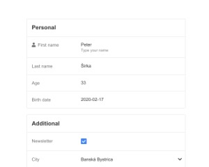
form.push({ group: 'Personal', label: 'First name', name: 'user.firstname', type: 'string', value: 'Peter', transform: 'capitalize' });
form.push({ group: 'Personal', label: 'Last name', name: 'user.lastname', type: 'string', value: 'Širka', placeholder: 'String' });
form.push({ group: 'Personal', label: 'Age', name: 'user.age', type: 'number', value: 33, min: 30 });
form.push({ group: 'Personal', label: 'Birth date', name: 'user.birth', type: 'date', value: NOW });
form.push({ group: 'Additional', label: 'Newsletter', name: 'user.newsletter', type: 'bool', value: true });
form.push({ group: 'Additional', label: 'City', name: 'user.city', type: 'list', value: 2, items: 'items', dirsearch: 'Search city', dircustom: true });
form.push({ group: 'Additional', label: 'Color', name: 'user.color', type: 'color', value: '#e73323' });
form.push({ group: 'Additional', label: 'Icon', name: 'user.icon', type: 'fontawesome', value: 'ti ti-home' });
form.push({ group: 'Additional', label: 'Emoji', name: 'user.emoji', type: 'emoji', value: '', show: 'n => n.age === 33' });Data properties in data declaration:
name{String}an item identifier (required)label{String}a label (required)group{String}a group name (required)note{String}a small note under controltype{String}a type (required)placeholder{String}a placeholder (supports few types only)transform{String}forstringtype only, can containcapitalize,uppercase,lowercaseorslugmaxlength{Number}forstringtype onlyvalidate{RegExp/String}forstringtype only, can containemail,phoneorurlmin{Number}fornumbertype onlymax{Number}fornumbertype onlyinc{Number/String}increments a value according to the value, targeted fornumberordate(can contain1 dayor-1 day) type onlyrequired{Boolean}for typestring,numberordatedirsearch{String/Boolean}a placeholder forlisttype only, boolean disables searchdircustom{Boolean}enables a custom value forlisttype onlydirkey{String}a key name for label/name, targeted forlisttype only (default:name)dirvalue{String}a key name for value, targeted forlisttype only (default:id)detail{String}URL address for obtaining of data forlisttype, example:/users/{0}/and{0}will be replaced with the value from listitems{Object Array/String}items forlisttype only, string can contain a path toArrayorURL addressto searchshow{Arrow function}, example:data => data.KEY === 'SOMETHING'--> will show the item if the condition will validicon{String}Total icon, can contain a color e.g.ti ti-home #00000ricon{String}Right Font-Awesome icon or text e.g.!HTML textriconclick{String}a path to the methodfunction(item, set(new_val))camouflage{Boolean}only forstringtypemonospace{Boolean}it uses a monospace font
Allowed types in data:
stringboolnumberdatelistcoloremojifontawesomeexec(can execexecmethod)text(readonly value)menu(it's similar to list but the component will executej-Menu)
Missing types:
datetimetimefilemonths
Good to know
The component extends the Array by adding:
invalid{Boolean}field determines if thevalueis invalid (default:undefined)changed{Boolean}field determines if thevaluehas been changed (default:undefined)prev{???} field contains an initial value
Author
- Peter Širka petersirka@gmail.com
- License
Created
17. february 2020
Updated
14. october 2024
jComponent library
19
Version
v1
License
https://www.totaljs.com/license/
Dark mode
Yes
Responsive
Yes
Author
Peter Širka
Email
petersirka@gmail.com