Web Component: j-SelectBox
j-SelectBox
- jComponent
v19|v20
Configuration:
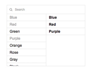
required{Boolean}(optional) enablesrequired(default: false)items{String}(optional) static itemskey1|value1, key2 with value, key3|valuetype{String}(optional) can benumber(convertsStringvalues toNumber)datasource{String}path to data-source (must be array)text{String}determines a property name for text (in data-source), default:namevalue{String}determines a property name for value (in data-source) default:idempty{String}(optional) adds an empty fielddisabled{Boolean}(optional) disables this componentsearch{String}(optional) enables search box with this value as a placeholderheight{Number}(optional) height (default:200)if{String}(optional) arrow function as a condition for filtering of datasource, example:if:n => !n.removed- NEW
raw{Boolean}(optional) allow raw HTML to be rendered as text (default:false)
Author
- Peter Širka petersirka@gmail.com
- License
Created
02. february 2017
Updated
17. april 2025
jComponent library
19 | 20
Version
v1
License
https://www.totaljs.com/license/
Dark mode
Yes
Responsive
Yes
Author
Peter Širka
Email
petersirka@gmail.com