Web Component: j-ServerList
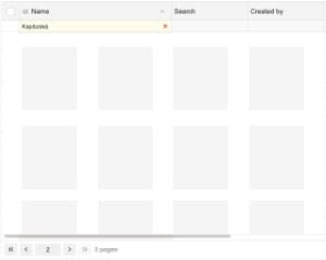
j-ServerList
BETA VERSION. This componnet is designed for single page and enterprise applications.It has nearly the same functionality as the j-ServerGrid, but it gives developers more freedom to create custom item rendering.
- jComponent
v19|v20 - please try to understand the functionality
Data-source needs to contain:
{
    columns: [
        {
            id: 'name',
            name: 'Name',
            width: 150, // optional (default: config.colwidth)
            filtering: false, // optional (default: false)
            sorting: false, // optional (default: false)
            align: 1, // optional: 0 or left (default), 1 or center, 2 or right
            alignheader: 1, // optional: 0 or left (default), 1 or center, 2 or right
            alignfilter: 1, // optional: 0 or left (default), 1 or center, 2 or right
            icon: 'ti ti-home', // optional: column icon
            dirsource: [{ id: 'String|Number|Boolean', name: '...' }] // optional: a dropdown filter (it needs "directory" component)
        }
    ],
    items: [{ name: 'Row <b>1</b> will be bold', html: 'RENDER' }, { name: 'Row 2', html: 'RENDER' }, ...] // items
    page: 1,    // current pages
    pages: 30,  // count of pages
    limit: 5,   // items limit per page
    count: 150  // count of items in DB
}Configuration:
colwidth{Number}a default column width in pixels (default:150)pluralizepages{String}pluralization for pages (optional, default:# pages,# page,# pages,# pages)pluralizeitems{String}pluralization for items (optional, default:# items,# item,# items,# items)margin{Number}a top margin for height (optional, default:0)noborder{Boolean}can remove a border (default:false)parent{String}selector forautoheight option (default:window)height{Number}a fixed heightfilter{String}a default placeholder for all filters (optional)click{String}a link to a path orfunction(row, row_element)exec{String}a link tofunction(type, filter, sort, page)for server-side operations (supported types:filter,pageandsort)display{Boolean}enables auto adding jComponent responsive classd-xs,d-lg, etc. according to the screen width (default:true)empty{String}an empty message (default:No records found.)- NEW:
scrollbarshadow{Boolean}enables scrollbar shadow (default:false) - NEW:
scrolltop{Boolean}it automatically scrolls to the top after the data source is changed (default:true)
Good to know:
NULL('link.to.data')evaluatesconfig.exec
Custom templating
The ServerList component attempts to locate a Tangular template. If one exists, the component uses it. Otherwise, it tries to render a content from the html property of each item/row.
<ui-component name="serverlist" ...>
    <script type="text/html">
        <!-- "value" represents each row -->
        <!-- "$" represents the entire datasource -->
        <div>{{ value.name }}</div>
    </script>
</ui-component>
Author
- Peter Širka petersirka@gmail.com
- License
Created
30. july 2025
Updated
13. august 2025
jComponent library
19 | 20
Version
v1
License
https://www.totaljs.com/license/
Responsive
Yes
Author
Peter Širka
Email
petersirka@gmail.com