Web Component: j-Suggestion
j-Suggestion
easy usage for different cases
supports 3 orientations
left,centerandrightsingleton
works with Bootstrap Grid System
works with touches
supports dark mode
jComponent
v19|v20
Methods:
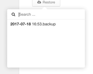
Method: component.show(orientation, targetElement, [items/function(search, next)], clickCallback)
orientation{String}can beleft,centerorrighttargetElement{Selector/jQuery/Element}a target where the component will be visibleitems {Array}optional and must have this structure:[{ name: String, value: String, icon: String }]otherwise will be items read from the target'sdata-optionsattribute.callback(selectedItem){Function}is triggered when the user clicks on the item
Method: component.hide()
Attributes:
targetElementcan containdata-options="Name 1|ti-building|Value 1;Name 2|ti-github|Value 2;"attribute with all items of the context menu.
Configuration:
placeholder- a placeholder for the search input
Server-side searching:
SETTER('suggestion', 'show', element, function(search, next) {
    next([{ name: 'Item 1' }, { name: 'Item 2' }]);
}, function(selected) {
    console.log(selected);
});
If the value isn't defined then the component uses name as value.
Global events:
ON('suggestion', function(visible, component, target) {
    console.log('Suggestion is', visible ? 'visible' : 'hidden');
});
Author
- Peter Širka petersirka@gmail.com
- License
Created
18. july 2017
Updated
31. january 2023
jComponent library
19 | 20
Version
v1
License
https://www.totaljs.com/license/
Dark mode
Yes
Responsive
Yes
Author
Peter Širka
Email
petersirka@gmail.com