Web Component: j-Table
j-Table
- jComponent
v19|v20 - try to understand the functionality
j-Tableis a very very very simple alternative toj-DataGridtargeted for UIdata-sourceexpectsArrayorObjectwith{ page: 1, pages: 10, limit: 50, items: [], count: 1000 }
Configuration:
highlight{Boolean}enables highlighting of the row (default:true)unhighlight{Boolean}enables undo-highlighting of the row (default:true)multiple{Boolean}enables multiple row highlighting (default:false)detail{Boolean/String}ifstringthen the value must be a link tofunction(row_data, next_fn(new_data_for_detail_template_OR__new_html), tdelement)exec{String}a path tofunction(row/rows)or path tovariableremember{Boolean}enables remembering of last selected rows (default:false)pk{String}a primary key (default:id)border{Boolean}enables border (default:true)scrollbar{Boolean}enables custom scrollbar (default:false) + important:heightmust be specifiedheight{Number/String}height of grid or can contain selectorwindow,parentor custom selector.ui-viewbox-bodypaginate{String}a link tofunction(model)for performing pagination{ page: 1, limit: 10, sort: [] }redraw{String}a link to function, it's evaluated when the table is redrawingfilter{String}a link to function, it's evaluated before the table is renderingdblclick{String}a link to function, it's evaluated when the user performs double-clickdatasource{String}path to data-source (for other extra data in the template. Usage:{{ $.data.something }})click{String}a path tofunction(button_name, row, button_element), is executed when the user will click on the buttonflat{Boolean}removes padding in cells (default:false)noborder{Boolean}removes border around (default:false)- NEW:
hidewhenempty{Boolean}hides table when empty (default:false)
Good to know:
- each
trelement containsdata-indexattribute withrowindex - each
tdelement of detail containsdata-indexattribute withrowindex
HTML definition:
<ui-component name="table" path="" config="">
<!--
data-size="TD1,TD2,TD3" : column width, optional (can contain pixels or percentage), "0" means "auto" width
data-head="TD1,TD2,TD3" : column names, optional
data-align="TD1,TD2,TD3" : column align, optional (0: left, 1: center, 2: right)
data-type="TYPE" : can be "detail" (Tangular template) or "empty" (empty is rendered when the Array is empty)
data-display="MD,XS" : can contain display types "LG" large, "MD" medium, "SM" small, "XS" extra small
data-sort="name,,price" : enables sorting, can contain the name of fields (a column with empty value will have disabled sorting)
-->
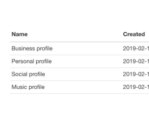
<script type="text/html" data-size="0,150px,50px" data-head="Name,Created,Opt" data-align="0,0,1" data-sort="1">
<tr>
<td>{{ name }}</td>
<td>{{ dtcreated | format('[date]') }}</td>
<td>OK</td>
</tr>
</script>
<script type="text/html" data-type="detail">
DETAIL: {{ name }}
HIDDEN COMMANDS: {{ $.index }} or {{ $.user }}
</script>
<script type="text/html" data-type="empty">
EMPTY
</script>
</ui-component>Good to know:
data-headcan contain Font Awesome icons, it must be wrapped like thisdata-head="Name,'cog'"ordata-name="Name,'youtube fab'"NULL('link.to.data')evaluatesconfig.paginate
Author
- Peter Širka petersirka@gmail.com
- License
Created
16. february 2019
Updated
29. october 2024
jComponent library
19 | 20
Version
v1
License
https://www.totaljs.com/license/
Dark mode
Yes
Responsive
Yes
Author
Peter Širka
Email
petersirka@gmail.com