Web Component: j-Textbox
j-Textbox
- jComponent
v19|v20
Configuration:
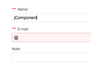
type{String}(optional) can beemail,phone,password,date,number,search,lower,upperor empty (default)required{Boolean}(optional) enables "required" (default:false)icon{String}(optional) icon for label e.g.home,cog, etc.icon2{String}(optional) icon in the right box e.g.home,cog, etc.label{String}(optional) label (default is HTML content)autofocus{Boolean}(optional) focuses the input (default:false)align{String}(optional)left(default),rightorcenterautofill{Boolean}(optional) enables the browser's autofill feature (default:false)placeholder{String}(optional) adds aplaceholdertext into the inputmaxlength{Number}(optional) sets a maximum length of charsminlength{Number}(optional) sets a minimum length of charsvalidation{String}(optional) a condition forevaluatione.g.value.match(/[a-z]+/) !== nullformat{String}(optional) output formatting e.g. for dates (default:yyyy-MM-dd)increment{Boolean}(optional) enables controls for incrementing of numbers (default:false)keypress{Boolean}(optional) can disable real-time binding values (default:true)delay{Number}(optional) can increase/decrease delay for real-time binding (default:300ms)disabled{Boolean}(optional) disables this componenterror{String}(optional) adds astringtext under the inputiconclick{String}(optional) needs to contain a link to a functionautocomplete{String}(optional) needs to contain a link to a function, is triggered on thefocuseventspaces{Boolean}(optional) enables spaces otherwise it removes them (default:true)readonly{Boolean}optional, defaultfalse- NEW
innerlabel{Boolean}optional, enables inner label (default:true)
Interesting:
type:dateuses thecalendarcomponent
Author
- Peter Širka petersirka@gmail.com
- License
Created
06. august 2015
Updated
10. june 2024
jComponent library
19, 20
Version
v1
License
https://www.totaljs.com/license/
Dark mode
Yes
Responsive
Yes
Author
Peter Širka
Email
petersirka@gmail.com