ListDetail
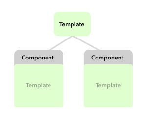
Splits content into a list and a resizable detail panel, side by side or stacked, with the detail shown when the path has a value
The component divides the content for listing part and detail part. Displaying of detail part depends on the path {Boolean}.
Configuration:
parent {String}parent element for obtaining of width/height (default:auto)margin {Number}a margin for height (default:0)width {Number/String}a detail panel width (default:35%)minwidth {Number/String}a minimal width of the detail panel (default:20%)maxwidth {Number/String}a maximal width of the detail panel (default:50%)resize {Boolean}enables/disables detail panel resizing (default:true)- NEW:
position {String}split orientation:vertical(side-by-side) orhorizontal(stacked) (default:vertical) - NEW:
height {Number/String}a detail panel height (only forposition:horizontal; when set, it overrideswidthfor sizing the detail panel) (default:null) - NEW:
minheight {Number/String}a minimal height of the detail panel (only forposition:horizontal+height) (default:null) - NEW:
maxheight {Number/String}a maximal height of the detail panel (only forposition:horizontal+height) (default:null)
Parts: list + detail must be wrapped to independent <section> element, e.g.
<ui-component name="listdetail__...">
    <section>
        LIST
    </section>
    <section>
        DETAIL
    </section>
</ui-component>